



Wednesday, April 25, 2018
Growth Acceleration in the West African Economic and Monetary Union
From a new IMF country report:
“The West African Economic and Monetary Union (WAEMU) member countries have experienced growth acceleration since 2012. Relative to an earlier reference period in the 1990s, the WAEMU’s recent strong growth has coincided with an increase in macroeconomic stability and investment, improvement in political institutions, improvement in the terms of trade, and increase in productivity.”
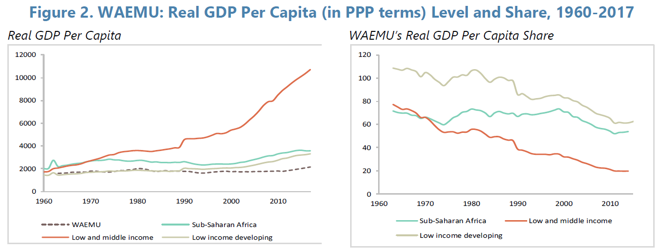
“Real GDP per capita in WAEMU countries has remained mostly stagnant while it has increased in other LIDCs (Figure 2). Income per capita in the WAEMU was close to that of the group of low and middle-income countries or low income developing countries or SSA in the early 1960s. However, since then, in terms of per capita income, WAEMU’s countries have experienced a widening gap relative to other LIDCs. While the share of the WAEMU income per capita in purchasing power parity—PPP—was 108 percent of that of the group of low-income developing countries in the early 1960s, it dropped to 65 percent in 2017.”
Continue reading here.
From a new IMF country report:
“The West African Economic and Monetary Union (WAEMU) member countries have experienced growth acceleration since 2012. Relative to an earlier reference period in the 1990s, the WAEMU’s recent strong growth has coincided with an increase in macroeconomic stability and investment, improvement in political institutions, improvement in the terms of trade, and increase in productivity.”
“Real GDP per capita in WAEMU countries has remained mostly stagnant while it has increased in other LIDCs (Figure 2).
Posted by at 1:37 PM
Labels: Inclusive Growth
Tuesday, April 24, 2018
Okun’s Law in Brazil and Three of Its Metropolitan Areas
A new paper finds that “Okun’s Law is valid in Brazil as a whole and in one of the three metropolitan regions studied and there are regional differences in the responsiveness of labor markets to output fluctuations and deviations from their long-term levels.”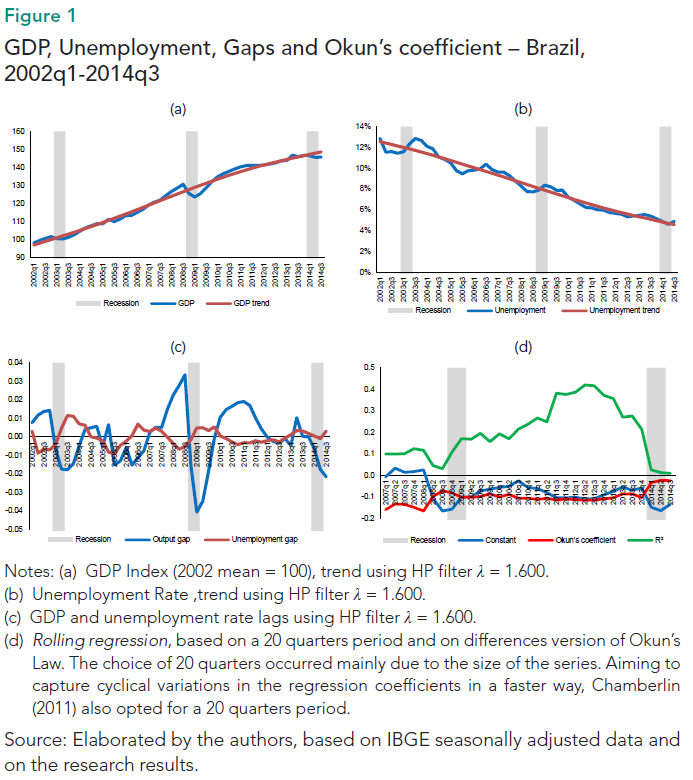
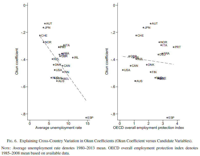
This paper also notes the findings from my paper that “The Okun’s coefficient varies substantially from country to country. Idiosyncratic characteristics of national labor markets explain in part this variation. (Ball; Leigh; Loungani, 2012).” […] “According to Ball, Jalles and Loungani (2014) the magnitude of the coefficient also depends on the costs related to the adjustment of employment, which can be either technological costs or costs arising from the employment protection laws; and the number of workers entering and leaving the labor force. Because these factors are different between countries so tend also to be the coefficients.”
Continue reading here.
Ball, Leigh, and Loungani (2012) is available here.
Ball, Jalles, and Loungani (2014) is available here.
A new paper finds that “Okun’s Law is valid in Brazil as a whole and in one of the three metropolitan regions studied and there are regional differences in the responsiveness of labor markets to output fluctuations and deviations from their long-term levels.”
This paper also notes the findings from my paper that “The Okun’s coefficient varies substantially from country to country. Idiosyncratic characteristics of national labor markets explain in part this variation.
Posted by at 2:57 PM
Labels: Inclusive Growth
Understanding Singapore’s Housing Market
Global Housing Watch Newsletter: April 2018
In this interview, Sock-Yong Phang talks about her new book on Singapore’s housing market—Policy Innovations for Affordable Housing In Singapore: From Colony to Global City. Phang is Celia Moh Chair Professor of Economics at the Singapore Management University, Singapore.
On key characteristics of Singapore’s housing market…
Hites Ahir: How is Singapore’s housing market unusual compared to the housing market in other countries?
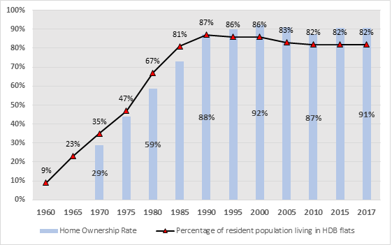
Sock-Yong Phang: Singapore has a very high homeownership rate of 91 percent, and the government’s involvement in the housing market is rather unusual. The Housing and Development Board (HDB), a statutory board of the Ministry of National Development, is the largest housing developer. In 1960, 9 percent of the population lived in rental public housing. By 1985, four-fifths of the resident population were living in HDB flats. More than 90 percent of HDB’s housing have been sold on 99-year lease tenure to eligible households – at below market prices. Buyers can sell their HDB flats in an active secondary market at market prices after 5-years.
Chart 1: Resident Population Living in HDB Flats and Homeownership Rate
Data sources: Singapore government websites
Hites Ahir: What are the key housing policies that have made a difference to Singapore’s housing market?
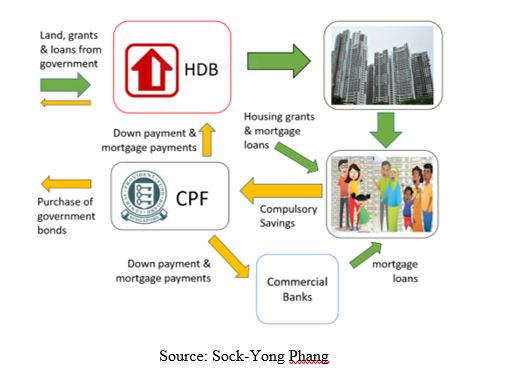
Sock-Yong Phang: One key policy is that HDB housing has transformed the physical and socioeconomic landscape. Another key policy in 1968 allowed Central Provident Fund (CPF) savings to be withdrawn by members for housing down payment, and mortgage payments. The HDB and CPF together formed an integrated sustainable framework for affordable homeownership.
Chart 2: An integrated sustainable framework for affordable homeownership
Hites Ahir: In your new book, you talk about Henry George—an American economist. Can you talk a bit about his ideas, and how it relates to Singapore?
Sock-Yong Phang: In 19th century America, Henry George observed that the explosive growth of industrial output generated dramatic increases in urban land prices. The windfalls for landowners, in turn, fueled a frenzy of land speculation and real estate bubbles and volatility. While industrialists, bankers and landowners amassed enormous wealth in the Gilded Age, there was a simultaneous rise in poverty, inequality, and social unrest. In 1879, George published a critique of the capitalist system in Progress and Poverty. His controversial view was that land should be common property, and society should share in any increase in land rents. His proposal was for a 100 percent single tax on land values.
A commentator of an article I wrote described Singapore as ‘the most Georgist” place on earth. However, there is no mention of George in the intense policy debates on land policy in the 1960s. The policymakers of that era recognized the huge importance of land to jumpstart the economy, and the housing program. Their observations on the unfairness of unearned land value increments, the negative impacts of land speculation, and the need for the state to capture land values mirrored those of George’s. However, the policies they implemented differed. These policies include compulsory state land acquisition at below market prices, development charges, and government land sales.
The state’s ownership of more than 90 percent of land enabled coordinated land use planning, and flexibility to shift allocations among competing needs for economic development. Greater reliance on land-based revenues also made feasible lower taxes on businesses, and employment. Effective land value capture facilitated growth-enhancing public-sector investments in urban infrastructure, industrial parks, urban redevelopment projects, and redistribution through HDB housing.
On affordable housing and inequality…
Hites Ahir: How does Singapore finance affordable housing for its low, and middle-income groups?
Sock-Yong Phang: Singaporeans typically purchase their first home from the HDB. The HDB provides up to 25-year mortgage loans, at an interest rate of 2.6 percent. HDB prices are below market prices, and buyers enjoy additional discounts in the form of housing grants calibrated to incomes. The government sells land to the HDB, and fully finances its annual deficit. Within the housing sector, there is a high degree of progressive taxation. Higher-income households, foreigners, and investors pay market prices, implicit higher land taxes, higher stamp duties, and are subject to higher rates of property taxes.
Hites Ahir: In the book, you also talk about housing market segmentation for housing affordability. Could you elaborate on this?
Sock-Yong Phang: If someone were to ask me for advice on what housing to buy, and how much it would cost, I would have to ask several questions. Are you a citizen, permanent resident, or foreigner? What is your household income? Are you a first-time buyer? Are you married or single? If single, how old are you? Do you plan to live near or with your parents? What is your ethnicity? These questions give a sense of the means testing, and profiling used for market segmentation. Spatially though, careful land use planning and quotas are used to integrate different household types for inclusive neighborhoods.
Hites Ahir: Did Singapore had to deal with the formation of slums?
Sock-Yong Phang: Slums and squatter settlements were prevalent in Singapore in the 1960s when a majority of the population lived in crammed conditions in pre-war shophouses, and attap/zinc-roofed housing. It was under such dire conditions that the government made improvements to housing conditions a key priority.
Hites Ahir: In the book, you also say that growing inequality has become a concern worldwide. “Discussions about solutions to tackle the challenges of poverty and inequality have tended to revolve around higher taxes on wealth and labor market interventions such as minimum wages and universal basic incomes.” What has Singapore done?
Sock-Yong Phang: Singapore has used housing policies extensively to mitigate wealth inequality. The housing tax and subsidy regime is highly progressive. Interestingly, I estimated the gross housing wealth distribution, and found it approximates the capital ownership distribution in Thomas Piketty’s vision of an ‘ideal society’.
On foreign investors and speculation…
Hites Ahir: For the past two-three years, there has been a lot of discussion on the impact of foreign investors, and speculation in the housing market. Has Singapore done anything on this? Did it work?
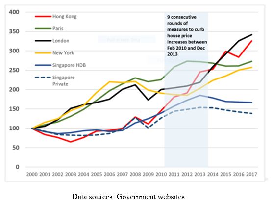
Sock-Yong Phang: Housing is an important consumption item, and household asset. Prices should not be dependent on foreign speculators and investors, foreign monetary policies, and global liquidity. Singapore keeps foreigners out of the HDB, and the landed housing sectors. Foreigners can only buy private condominiums – which are about 20 percent of the market. Despite this, price spillover effects to other protected market segments led the government to impose 9 rounds of measures to discourage foreign, and investment demand from 2010 to 2013. The instruments deployed include stamp duties, and caps on borrowing. These measures, in combination with an increase in housing supply, and slower population growth, worked – price increases started to taper off by late 2013.
Chart 3: Effectiveness of measures to curb house price increases in Singapore: comparison with house price trends (nominal prices) in 4 other global cities
On other issues…
Hites Ahir: Singapore has a homeownership rate of 90 percent. Why is the rental market not attractive or promoted?
Sock-Yong Phang: The Singapore government is, generally speaking, non-ideological, with a practical, pragmatic approach to economic policies. However, homeownership has almost the status of an ideology in Singapore. This has worked for a city-state where spatial mobility is less of an issue, and has allowed low and middle-income households to own an asset, and benefit from housing price appreciation.
Hites Ahir: Can you talk about how the median age of the population has changed over time, and what challenges this presents?
Sock-Yong Phang: The median age increased from 34.0 years in 2000 to 40.5 in 2017. Lower-income ageing homeowners are often “housing asset rich and cash poor”. The government has devised schemes to help homeowners liquidate housing equity for retirement financing. One option is to downsize to a smaller or shorter lease HDB flat. Another scheme allows homeowners to sell the tail-end of their property’s lease to the HDB. However, the low take-up rate remains a puzzle.
Hites Ahir: Why do you think it is difficult to find strong advocates for government centered housing welfare systems?
Sock-Yong Phang: Housing markets are incredibly complex. Policies designed with good intentions can go wrong, or they can become entrenched over time. Examples of policy failure include socialist housing systems, rent control, US public housing projects, and the subprime mortgages crisis. My 2013 book Housing Finance Systems: Market Failures and Government Failures has extensive discussion on these challenges.
Global Housing Watch Newsletter: April 2018
In this interview, Sock-Yong Phang talks about her new book on Singapore’s housing market—Policy Innovations for Affordable Housing In Singapore: From Colony to Global City. Phang is Celia Moh Chair Professor of Economics at the Singapore Management University, Singapore.
On key characteristics of Singapore’s housing market…
Hites Ahir: How is Singapore’s housing market unusual compared to the housing market in other countries?
Posted by at 5:00 AM
Labels: Global Housing Watch
Housing in Africa: A Crisis or An Opportunity?
Global Housing Watch Newsletter: April 2018
In this interview, Issa Faye, El-Hadj M. Bah, and Zekebweliwai F. Geh discuss their new book—Housing Market Dynamics in Africa. Faye is currently a Director at the International Finance Corporation and formerly a Manager at the African Development Bank. Bah is Principal Research Economist also at the African Development Bank. And Geh is a Policy Advisor also at the African Development Bank.
On the main message…
Hites Ahir: The opening line of this new book says: “(…) this book comes at a very critical time for Africa.” Can you elaborate on this?
Authors: The aftershocks of the global economic downturn continue to stymie growth. Low commodity prices and a sluggish global economic growth has slowed down the growth momentum in several African countries. At the same time, the continent’s rising urbanization is putting immense pressure on the already stretched urban infrastructure in various cities, while growing debt level is lowering the ability of governments to mobilize external sources of finance. Moreover, Africa’s growing youth unemployment is a rising threat that demands urgent action. Addressing these problems require an economic transformation that will create jobs, reduce poverty and inequality. Leveraging the abundant workforce for manufacturing and labor-intensive industries should therefore be encouraged.
Hites Ahir: In a nutshell, what is the main message of this book?
Authors: Five key messages emanate from our research. First, Africa is facing a looming housing crisis as the affordable housing supply dwarfs demand, particularly in the formal sector. This annual shortage is adding to the existing large deficits observed in many cities across the continent. This has led to the proliferation of slums. Second, while addressing the affordable housing shortage will be a huge challenge, it also presents an opportunity for structural transformation and inclusive growth in Africa. Third, creating an enabling environment for the supply of affordable rental housing should be part of any national housing strategy. Fourth, strong political leadership is crucial for transforming the sector. Governments need to effectively implement their role as regulators, input providers, and facilitators. Last but not the least, we argue that development financial institutions have a catalytic role to play by assisting governments in fulfilling their various roles, as well as provide long-term financing needed for the development of affordable housing finance markets.
Hites Ahir: How different is this book compared to the work that the Center for Affordable Housing Finance in Africa, the World Bank, and others have done on Africa?
Authors: This book offers the most comprehensive coverage of issues related to housing development in Africa. It is the result of not only desk research but also of extensive consultation with stakeholders on the ground. This has guided the proposed solutions.
On large housing deficits…
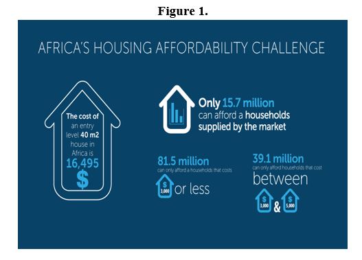
Hites Ahir: The book says: “The rapid urbanization rates and lack of urban planning have resulted in very large housing deficits, defined as the difference between the number of households, and the number of permanent dwellings.”. Can you tell us in numbers how big is the housing deficit in Africa?
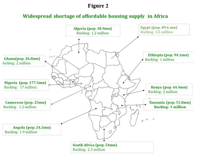
Authors: We conservatively estimate the deficit to be at least 50 million housing units (50.6 million to be precise). We should emphasize that this is a rough estimate given the absence of recent housing census data in all countries. Generally, the most populous countries have larger deficits.
Hites Ahir: What explains these large housing deficits across countries?
Authors: Several factors explain the large housing deficits observed in the continent. Rapid urbanization fueled by rural to urban migration and endogenous population growth is raising the demand for housing. However, the supply of housing has been insufficient for several reasons. First, poor urban planning is hampering urban expansion through limited supply of land and infrastructure. Second, multiple land tenure regimes, and inadequate land administration and governance systems contribute to land tenure insecurity and the high costs of urban land. Third, high construction costs make housing unaffordable to the majority of low and middle-income households. Furthermore, underdeveloped housing finance markets imply that most Africans can only rely on self-financing and incremental construction mechanisms to acquire housing.
Hites Ahir: What are the social and economic consequences of housing deficits?
Authors: Housing deficits in Africa mean that a large percentage of Africans live in slums, which is characterized by poor housing conditions and lack of basic infrastructure such as roads, electricity, piped water and sewage. A large literature has shown that those living conditions lead to poor health conditions (e.g. malaria, cholera, tuberculosis, respiratory diseases, stress and depression), lower educational attainment, insecurity and an overall poor contentment with life. These poor health outcomes lead to lower work productivity and increases the disease burden of countries. Moreover, lower educational opportunities for children in slums implies lower overall human capital in the future. Large housing deficits also imply higher housing costs, which means that overall savings and investment in productive activities will be lower.
Hites Ahir: What can be done?
Authors: A one-size fits all approach will not resolve Africa’s housing deficit. Possible solutions should take into account country specific challenges. However, comprehensive policies should simultaneously address constraints on the supply and the demand sides. The challenge on the supply side is how to increase the availability of affordable housing. Actions that will have great impact include updating urban plans, taking into account recent socioeconomic developments; reforming land administration and governance systems with the aim of improving tenure security, increasing the supply of well-located plots and lower overall land costs; and lowering construction costs. On the demand side, financing mechanisms, including guarantees, are needed to enable households to undertake the acquisition of housing overtime.
Hites Ahir: How much will it cost?
Authors: We estimate that eliminating the housing backlog of 50.6 million in 10 years will cost at least US$2.08 trillion. This estimate is based on the average construction cost for Africa and an assumption on the typology of housing needed and housing demand. While this number is large, such spending would add at least US$5.07 trillion to Africa’s GDP.
On the link between construction and inclusive growth…
Hites Ahir: Even with all the challenge that you have mentioned earlier, there is also an opportunity for Africa. The book says: “housing construction is a source of inclusive growth”. Can you elaborate on this?
Authors: Housing construction is labor-intensive with the construction of one housing unit creating between two and six full-time equivalent (FTE) jobs for at least a year. In addition, the sector employs a large number of young people with low skills. The strong forward and backward linkages also means that growth in the construction sector will stimulate growth in other sectors such as manufacturing.
Hites Ahir: The book points out that construction costs are high in Africa compared to other part of the world. What explains this?
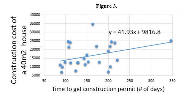
Authors: Failures at different steps of the construction value chain explain the high construction costs. The largest factor is the high costs of building materials, which represents more than 50 percent of the construction costs. Limited supply of construction materials, monopoly pricing and a large share of imports contribute to high building material prices. Government regulation and administrative burdens also plays an important role. For instance, we find that the time required to obtain construction permits is positively correlated with construction costs. Another factor is the lack of capacity of construction companies and lower technical skills of construction workers. In most countries, housing construction is dominated by small and medium enterprises with little or no capacity to deliver 500 housing units per year.
Hites Ahir: What have countries done to reduce constructions costs? Are there any quick and easy remedies that policymakers can implement?
Authors: The book discusses seven actions that can reduce construction costs. Here, we will mention just three. Labor-intensive industrialized construction has great potential to lower costs and accelerate housing delivery. This approach is being pursued in Ethiopia. Local production of building materials can also have dramatic effects on construction costs. For instance, in Zambia, cement prices decreased by 40% between 2014 and 2015 following the commissioning of a new production plant. Alternative building technologies, including the use of local building materials such as compressed stabilized earth blocks have shown that they can reduce construction costs. However, cultural biases and outdated building codes among other have prevented these technologies from taking off.
Concluding thoughts…
Hites Ahir: When working on this book, what would you say was the biggest surprising finding?
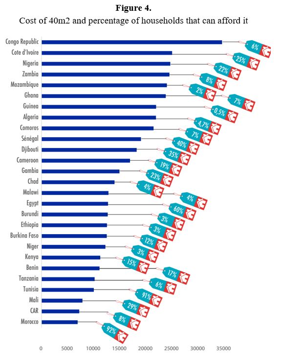
Authors: The cross-country variation of construction costs is perhaps the most surprising finding. It costs 5 times more to build a house in Congo than in Morocco.
Hites Ahir: With all the challenges that you have briefly described, which one you think will be the hardest to tackle? Why?
Authors: Government regulations and administrative burden is probably the hardest to tackle. Our analysis of the housing value chain shows that government failures are at the heart of many constraints on both the supply and demand sides. While a number of governments are undertaking regulatory reforms, effective implementation remains limited.
Hites Ahir: Is there a success story emerging from Africa—a country that is doing well in managing the housing market?
Authors: Ethiopia and Morocco are two countries that have shown great leadership and experienced great successes.
A final note: In our view, creating a conducive enabling environment, adopting and implementing a comprehensive housing strategy, as well as the existence of strong political will are prerequisites for addressing the continents housing crisis.
Global Housing Watch Newsletter: April 2018
In this interview, Issa Faye, El-Hadj M. Bah, and Zekebweliwai F. Geh discuss their new book—Housing Market Dynamics in Africa. Faye is currently a Director at the International Finance Corporation and formerly a Manager at the African Development Bank. Bah is Principal Research Economist also at the African Development Bank. And Geh is a Policy Advisor also at the African Development Bank.
Posted by at 5:00 AM
Labels: Global Housing Watch
Housing, Urban Development, and the Macroeconomy
Global Housing Watch Newsletter: April 2018
This post is written by Kilian Heilmann, and Andrea Nocera. Both are Postdoctoral Research Associate at the Dornsife Institute for New Economic Thinking (INET) at the University of Southern California.
The USC Dornsife Institute for New Economic Thinking (INET) organized a conference on “Housing, Urban Development, and the Macroeconomy” on April 6th and 7th at the University of Southern California. The conference brought together researchers from a wide range of fields to discuss recent developments in the research on housing. Organized into 7 sessions of similar thematic overlap, 7 invited speakers, and 17 contributing speakers presented their papers over two days. The presenters came from a diverse background, and represented academic institutions, and central banks from America, Europe, and Australia.
On the relationship between housing and credit…
After the opening remarks by INET Director M. Hashem Pesaran, the first session focused on the relationship between housing and credit. Matteo Iacoviello (Federal Reserve Board) led the discussion presenting his joint work with Ricardo Nunes and Andrea Prestipino, titled “Optimal Credit Market Policy”. The authors advocated a simple countercyclical housing tax to avoid excessive under/overborrowing (presentation). Edward Kung (UCLA, “Interest Rates and Housing Market Dynamics in a Housing Search Model” with Elliot Anenberg) provided new evidence on the role of mortgage rates in the housing market. Xiaoqing Zhou (Bank of Canada, “Home Equity Extraction and the Boom-Bust Cycle in Consumption and Residential Investment”) questioned the common view that higher mortgage loans contributed to higher consumption arguing that their main use was to finance housing investments (presentation). Further contributions to this important topic were given by Isaac Gross (Oxford University, “Anticipated Changes in Household Debt and Consumption”) who suggested that households that anticipate a house purchase may have low or even negative marginal propensities to consume, and discussed possible implications of tax credits for first-time home buyers.
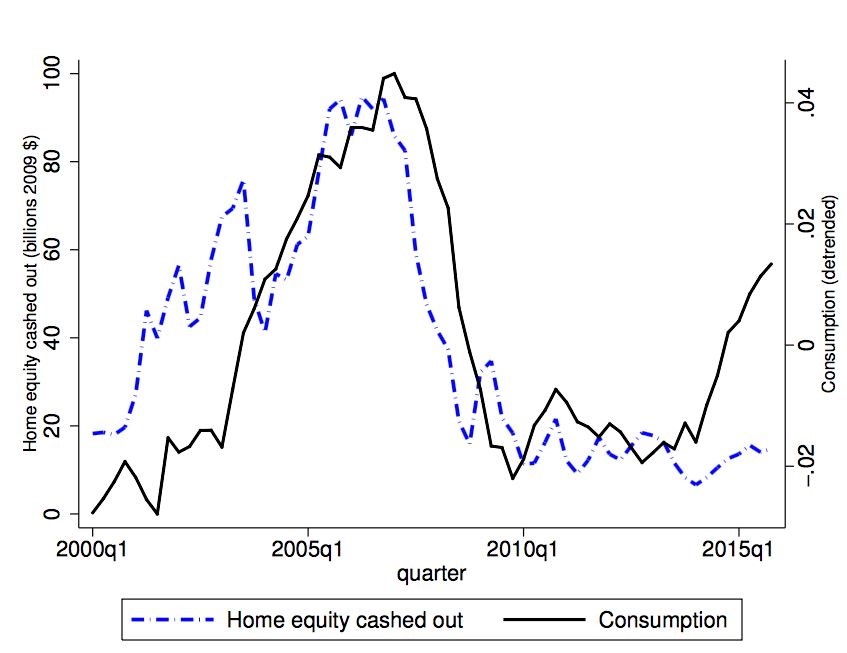
Note: Home equity and consumption. Taken from: Zhou (2018), Home Equity Extraction and the Boom-Bust Cycle in Consumption and Residential Investment
On crises and housing market dynamics…
Crises and housing market dynamics were at the center of the second session which started with Chandler Lutz (Copenhagen Business School). His paper “A Crisis of Missed Opportunities? Foreclosure Costs and Mortgage Modification During the Great Recession” (joint with Stuart Gabriel and Matteo Iacoviello) investigates the housing impacts of the 2000s crisis-period California Foreclosure Prevention Laws. Tom Schmitz (Bocconi University, “The Financial Transmission of Housing Bubbles: Evidence from Spain”, with Alberto Martin and Enrique Moral-Benito) documented both crowding-out, and crowding-in effects of the Spanish housing bubble on the credit market (presentation). The session concluded with Jacob Cosman (Johns Hopkins) whose paper “Concentration and market cycles in the production of new housing” (with Luis Quintero) sheds new light on the impact of increasing concentration in local residential construction markets on housing cycle dynamics (presentation).
On housing regulation and migration…
In the third session “Issues in Housing Regulation and Migration”, Morris Davis (Rutgers) presented new evidence on “Gross Migration and Urban Population Dynamics” (joint with Jonas Fisher and Marcelo Veracierto). Andrii Parkhomenko (USC) discussed “The Rise of Housing Supply Regulation in the US: Local Causes and Aggregate Implications”, and highlighted the connection between housing supply regulations, and aggregate productivity. Christoph Hedtrich presented a model that studies the relationship between living costs, and investment in automation (“Automation, Spatial Sorting, and Job Polarization”, with Jan Eeckhout and Roberto Pinheiro). In the last presentation, Wukuang Cun (USC) spoke on “Land Use Regulations, Migration and Rising House Prices Dispersion in the US” (joint with Hashem Pesaran).
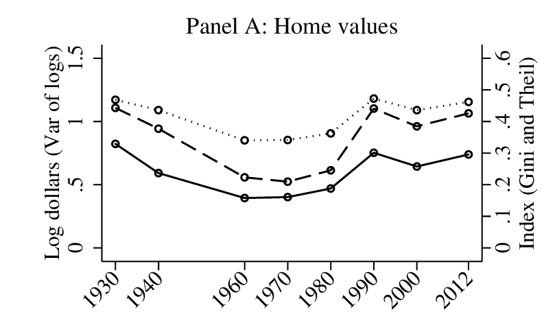
Note: Historic evolution of home value inequality. Taken from: Albouy et al (2018), Housing Inequality
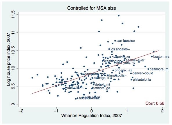
Note: Regulation and House Prices. Taken from: Parkhomenko (2018), The Rise of Housing Supply Regulation in the U.S.: Local Causes and Aggregate Implications
On neighborhood dynamics…
The last session of the day concerned issues in neighborhood dynamics. David Albouy (UIUC) presented new facts on historical housing inequality and constructed measures based on data from censuses dating back to 1930 (presentation). The results show evidence for a post WWII “great compression” in housing consumption, and highlighted the importance of within-MSA inequality (“Housing Inequality” with Aditya Aladangady and Mike Zabek). Jeffrey Brinkman (Fed Philadelphia, “Freeway Revolts!” with Jeffrey Lin) highlighted the heterogeneous effects of transportation infrastructure in the context of freeway construction. Amine Ouazad (HEC Montreal, “Dynamic Location Choice, Housing Market Frictions, and Real Estate Dynamics” with Romaine Ranciere) contributed with a paper that studies the impact of credit market frictions on neighborhood location choice. Lastly, Lorenzo Neri’s (Queen Mary University) paper on “School Performance, Score Inflation and Economic Geography” (joint with Erich Battistin) measured the effect of a noisy measure of school quality on housing prices.
On regional heterogeneity and the macroeconomy…
The second day of the conference started with a session on regional heterogeneity and the macroeconomy. Joseph Vavra (Chicago Booth) presented his joint research with Martin Beraja, Andreas Fuster, and Erik Hurst on “Regional Heterogeneity and the Refinancing Channel of Monetary Policy” where they argue that the distribution of housing equity plays a crucial role in the economy’s response to interest rate declines. Knut Are Aastveit’s (Norges Bank and BI Norwegian Business School) paper “Asymmetric Effects of Monetary Policy in Regional Housing Markets” (with Andre Anundsen) suggests that regional house price responses to monetary policy vary over the business cycle, and depend on housing supply elasticities. Francois Gerolf (UCLA, “Property Tax Shocks and Macroeconomics” with Thomas Grjebine) collects data on tax on housing property for OECD countries to measure the impact of property tax shocks on the macroeconomy. Natalia Bailey (Monash University, “Quasi Maximum Likelihood Estimation of Spatial Model with Heterogeneous Coefficients” joint with Miquele Aquaro and Hashem Pesaran) contributed to methodological advances by introducing heterogeneous coefficients in spatial econometric models.
On housing finance risks…
In a session on housing finance risks, Rodney Ramcharan (USC Marshall) presented his paper “Bank Balance Sheets and Liquidation Values” where he investigates the role of bank balance sheets in shaping the liquidation value of real estate collateral. In joint work with Lu Han “Financing Risk and Information Bias in Housing Markets”, Seung-Hyun Hong (University of Illinois) compares sales prices between all-cash transactions, and mortgage transactions in Los Angeles, and identifies financing risk and information bias as new sources of housing market frictions. You Suk Kim’s (Board of Governors of the Federal Reserve System) paper “The Effect of Government Mortgage Guarantees on Home Ownership” (with Serafin Grundl) finds that government mortgage guarantees have a very small effect on home ownership.
On homeownership and demography…
The conference concluded with a session on homeownership and demography. Jorge de la Roca’s (USC) paper “City of Dreams” (with Gianmarco Ottaviano and Diego Puga) highlighted that imperfect assessment of one’s own ability can lead to the observed fact that there is little sorting on ability between cities. In the last presentation of the conference called “Homeownership and Housing Transitions: Explaining the Demographic Composition” (with Eunseong Ma), Sarah Zubairy (Texas A&M) presented new evidence on uneven composition of homeownership rates during its surge from 1995-2005.
In conclusion, the conference reflected the variety of research approaches to the important topic of housing, and its related fields. Both microeconomists and macroeconomists as well as econometricians contributed to the program. The methods presented at the conference ranged from macroeconomic models to microeconomic analysis of historic data to econometric analysis of spatial heterogeneity. This reflected the spirit of the USC Dornsife Institute for New Economic Thinking to consider novel, and diverse approaches to the analysis of significant research questions.
Global Housing Watch Newsletter: April 2018
This post is written by Kilian Heilmann, and Andrea Nocera. Both are Postdoctoral Research Associate at the Dornsife Institute for New Economic Thinking (INET) at the University of Southern California.
The USC Dornsife Institute for New Economic Thinking (INET) organized a conference on “
Posted by at 5:00 AM
Labels: Global Housing Watch
Subscribe to: Posts