Monday, January 21, 2019
Does Ultra-Low Unemployment Spur Rapid Wage Growth?
From a new FRBSF Economic Letter:
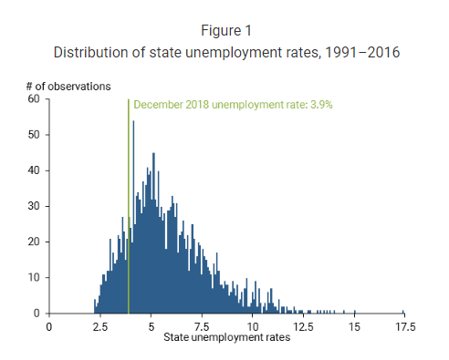
“The unemployment rate ended 2018 at just under 4%, substantially lower than most estimates of the natural rate. Could such an ostensibly tight labor market lead to a sharp pickup in wage growth from its recent moderate pace, such that the relationship between wage growth and unemployment is not always linear? Investigations using state-level data show no economically significant nonlinearity between wage growth and unemployment that would predict an abrupt jump in wage growth.”
“In sum, a careful look at the wage Phillips curve across states yields little evidence supporting the contention that wage growth sharply rises as the labor market reaches especially tight conditions. Of course, the current period may be different from the past. For instance, the typical pattern of local wage growth in a tight local labor market may differ when all other nearby labor markets are experiencing similar tightness, as is currently the case. As a result, geographical labor mobility—which can mute wage pressures in tight markets as workers are attracted to higher-wage areas—may be playing less of a restraining role. With this caveat in mind, given the historical experiences of states in recent decades, we do not foresee a sharp pickup in wage growth nationally if the labor market continues to tighten as many anticipate.”
From a new FRBSF Economic Letter:
“The unemployment rate ended 2018 at just under 4%, substantially lower than most estimates of the natural rate. Could such an ostensibly tight labor market lead to a sharp pickup in wage growth from its recent moderate pace, such that the relationship between wage growth and unemployment is not always linear? Investigations using state-level data show no economically significant nonlinearity between wage growth and unemployment that would predict an abrupt jump in wage growth.”
Posted by at 12:57 PM
Labels: Inclusive Growth
Predicting recessions using term spread at the zero lower bound: The case of the euro area
From a new VOX post:
“The flattening of the US yield curve has left academics, central bankers and market commentators divided, with one camp interpreting it as a sign of impending recession (in line with historical patterns), and the other camp arguing that this time is different given unprecedented changes in monetary policy and other structural forces. This column argues that the ECB’s quantitative easing programme undermined the performance of term spreads as predictors of recessions. It suggests and tests a modified term spread and several other variables that are more successful at predicting recessions. ”
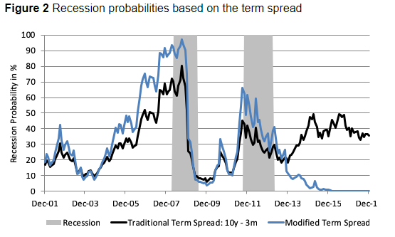
“This revised version of the term spread successfully predicts the 2011 recession with a lead time of two months, and signals an average recession probability above 50% during the first half of the recession. It also sees recession probabilities falling to 1% for the period between January 2015 and December 2017, which compares to an average recession signal of 40%, indicated by the traditional term spread over the same period (Figure 2). Given this, we find that switching to the shadow rate in face of the zero lower bound brings a valuable perspective on the term spread as an input factor to recession models.”
From a new VOX post:
“The flattening of the US yield curve has left academics, central bankers and market commentators divided, with one camp interpreting it as a sign of impending recession (in line with historical patterns), and the other camp arguing that this time is different given unprecedented changes in monetary policy and other structural forces. This column argues that the ECB’s quantitative easing programme undermined the performance of term spreads as predictors of recessions.
Posted by at 12:54 PM
Labels: Inclusive Growth
The Inequality Paradox: Rising Inequalities Nationally, Diminishing Inequality Worldwide
From a new ProMarket article:
“[…] The reduction in global inequality was driven by high income growth in heretofore very poor countries like China, India, Vietnam, and Indonesia where almost everybody had seen their incomes increase at a fast clip—much faster than in the rich world. Thus a sort of “global middle class” has been created.”
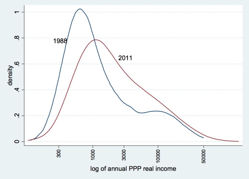
“Figure 2 shows this phenomenon through the thickening of the distribution around the middle: There are simply more people in the world with incomes that are around the world median. These are indeed not the people that, in Western perception, would be considered a “middle class” since their incomes are much lower than typical Western middle class incomes, but from the global point of view they are indeed a (large) group sitting right in the middle of the global income distribution and, if the trends continue, likely to move upward. The slowdown of growth (and several years of negative growth) that affected the rich West in the wake of the global recession further helped the convergence of Asian incomes and reduced global income inequality.”
“Two things are remarkable in the current decline of global income inequality: For the first time in the past 200 years, inequality among world citizens has decreased; and this decrease has taken place while within-national inequalities almost everywhere have gone up. These two facts, translated in terms of winners and losers, mean that workers and the middle classes in emerging economies did well, and workers and the middle classes in the rich world did poorly.”
From a new ProMarket article:
“[…] The reduction in global inequality was driven by high income growth in heretofore very poor countries like China, India, Vietnam, and Indonesia where almost everybody had seen their incomes increase at a fast clip—much faster than in the rich world. Thus a sort of “global middle class” has been created.”
“Figure 2 shows this phenomenon through the thickening of the distribution around the middle: There are simply more people in the world with incomes that are around the world median.
Posted by at 9:45 AM
Labels: Inclusive Growth
A Global Human Capital Index
From a new post by Timothy Taylor:
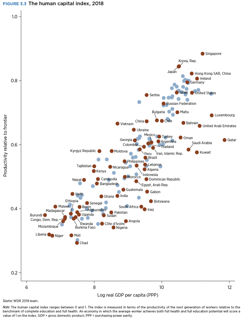
“On this figure, the horizontal axis measures countries of the world by per capita GDP. For those not used to reading per capita income levels converted to logarithms (!), $60,000 is equal to about 11. The vertical index scales human capital from zero to one. Here’s how countries of the world look:”
Posted by at 9:41 AM
Labels: Inclusive Growth
Intergenerational mobility in the US: One size doesn’t fit all
From a new VOX post:
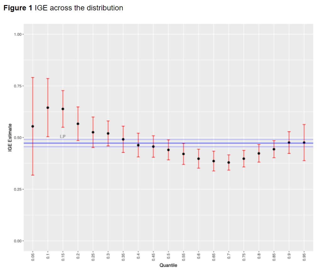
“Children in the upper-middle part of the conditional distribution show the smallest degree of intergenerational persistence, while top incomes and, especially, low incomes are very much conditioned by parental income. Interestingly, previous studies did not find an increase of IGE in the US from the 70th percentile onwards. Apart from the much bigger sample under consideration in our work, the observed difference is most likely due to the variable used – i.e. household income (instead of earnings) – which includes capital income, through which a great deal of the correlation between parental and children incomes in the upper part of the distribution occurs.”
From a new VOX post:
“Children in the upper-middle part of the conditional distribution show the smallest degree of intergenerational persistence, while top incomes and, especially, low incomes are very much conditioned by parental income. Interestingly, previous studies did not find an increase of IGE in the US from the 70th percentile onwards. Apart from the much bigger sample under consideration in our work, the observed difference is most likely due to the variable used – i.e.
Posted by at 9:39 AM
Labels: Inclusive Growth
Subscribe to: Posts


