Monday, January 21, 2019
A Global Human Capital Index
From a new post by Timothy Taylor:
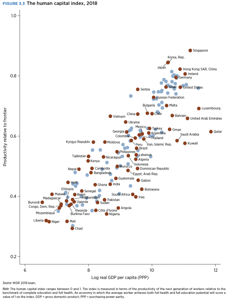
“On this figure, the horizontal axis measures countries of the world by per capita GDP. For those not used to reading per capita income levels converted to logarithms (!), $60,000 is equal to about 11. The vertical index scales human capital from zero to one. Here’s how countries of the world look:”
Posted by at 9:41 AM
Labels: Inclusive Growth
Subscribe to: Posts
