


Friday, February 28, 2020
Economists should learn lessons from meteorologists
From the Financial Times:
“The UK’s national weather service, the Met Office, is to get a £1.2bn computer to help with its forecasting activities. That is a lot of silicon. My instinctive response was: when do we economists get one?
People may grumble about the weather forecast, but in many places we take its accuracy for granted. When we ask our phones about tomorrow’s weather, we act as though we are gazing through a window into the future. Nobody treats the latest forecasts from the Bank of England or the IMF as a window into anything.
That is partly because politics gets in the way. On the issue of Brexit, for example, extreme forecasts from partisans attracted attention, while independent mainstream forecasters have proved to be pretty much on the money. Few people stopped to praise the economic bean-counters.
Economists might also protest that nobody asks them to forecast economic activity tomorrow or even next week; they are asked to describe the prospects for the next year or so. True, some almanacs offer long-range weather forecasts based on methods that are secret, arcane, or both — but the professionals regard such attempts as laughable.
Enough excuses; economists deserve few prizes for prediction. Prakash Loungani of the IMF has conducted several reviews of mainstream forecasts, finding them dismally likely to miss recessions. Economists are not very good at seeing into the future — to the extent that most argue forecasting is simply none of their business. The weather forecasters are good, and getting better all the time. Could we economists do as well with a couple of billion dollars’ worth of kit, or is something else lacking?
The question seemed worth exploring to me, so I picked up Andrew Blum’s recent book, The Weather Machine, to understand what meteorologists actually do and how they do it. I realised quickly that a weather forecast is intimately connected to a map in a way that an economic forecast is not.”
Continue reading here.
From the Financial Times:
“The UK’s national weather service, the Met Office, is to get a £1.2bn computer to help with its forecasting activities. That is a lot of silicon. My instinctive response was: when do we economists get one?
People may grumble about the weather forecast, but in many places we take its accuracy for granted. When we ask our phones about tomorrow’s weather, we act as though we are gazing through a window into the future.
Posted by at 8:48 AM
Labels: Forecasting Forum
Housing View – February 28, 2020
On the US:
- ‘A Mask for Racial Discrimination.’ How Housing Voucher Programs Can Hurt the Low-Income Families They’re Designed to Help – Time
- Why Does It Cost $750,000 to Build Affordable Housing in San Francisco? – New York Times
- The Airbnb Effect On Housing And Rent – Forbes
- US housing finance is stuck in a complex knot of contradictions – Financial Times
- Housing regulations are getting in the way of fighting homelessness – Washington Post
- The declining elasticity of US housing supply – VOX
- Joe Biden wants tougher standards for real-estate appraisers to help black and Latinx homeowners – MarketWatch
- Special briefing on walkability – American Enterprise Institute
- Does Joe Biden Have a Plan to Stop Gentrification? – Citylab
On other countries:
- [China] History and Outlook of China’s Housing Market – SpringerLink
- [Netherlands] Dutch house price boom continues – Global Property Guide
- [New Zealand] New Zealand’s housing market bounced back strongly – Global Property Guide
- [United Kingdom] Housing insecurity, homelessness, and populism: Evidence from the UK – VOX
On the US:
- ‘A Mask for Racial Discrimination.’ How Housing Voucher Programs Can Hurt the Low-Income Families They’re Designed to Help – Time
- Why Does It Cost $750,000 to Build Affordable Housing in San Francisco? – New York Times
- The Airbnb Effect On Housing And Rent – Forbes
- US housing finance is stuck in a complex knot of contradictions – Financial Times
- Housing regulations are getting in the way of fighting homelessness – Washington Post
- The declining elasticity of US housing supply – VOX
- Joe Biden wants tougher standards for real-estate appraisers to help black and Latinx homeowners – MarketWatch
- Special briefing on walkability – American Enterprise Institute
- Does Joe Biden Have a Plan to Stop Gentrification?
Posted by at 5:00 AM
Labels: Global Housing Watch
Thursday, February 27, 2020
Mobility and Political Upheaval in an Age of Inequality
From a paper by Danny Quah:
“Appropriate public policy on inequality hinges critically on understanding inequality’s e ects on the living conditions of the poor, on social mobility, and on nationalist populism. This paper describes two empirical regularities. First, an increase in inequality typically does not coincide with immiserisation of the poor and lower middle class. Over 80% of economies where inequality has risen since 2000 have also increased the average incomes of their populations’ bottom 50%. Second, for political upheaval, individual well-being and expectations on its trajectory matter more than inequality. When these causal factors diverge, the role of inequality is, thus, diminished. Public policy needs to counter misinterpretation and misinformation on inequality with rigorous analysis and empirical evidence.”
From a paper by Danny Quah:
“Appropriate public policy on inequality hinges critically on understanding inequality’s e ects on the living conditions of the poor, on social mobility, and on nationalist populism. This paper describes two empirical regularities. First, an increase in inequality typically does not coincide with immiserisation of the poor and lower middle class. Over 80% of economies where inequality has risen since 2000 have also increased the average incomes of their populations’
Posted by at 8:52 AM
Labels: Inclusive Growth
Tuesday, February 25, 2020
Untangling India’s Distinctive Economic Story
From Conversable Economist:
“It’s easy enough to explain why China’s economic development has gotten more attention than that of India. China’s growth rate has been faster. China’s effect on international trade has created more a shock for the rest of the global economy. In geopolitical terms, China looks more like a rival. Also, China’s basic story-line of trying to liberalize a centrally-planned economy while keeping a communist government is fairly easy to tell.
But whatever the plausible reasons why China’s economy has gotten more attention than India, it seems clear to me that India’s economic developments have gotten far too little attention. A symposium in the Winter 2020 issue of the Journal of Economic Perspectives offers some insights:
- “Dynamism with Incommensurate Development: The Distinctive Indian Model,” by Rohit Lamba and Arvind Subramanian
- “Why Does the Indian State Both Fail and Succeed?” by Devesh Kapur
- “The Great Indian Demonetization,” by Amartya Lahiri
I’ll also mention an article on “Caste and the Indian Economy,” by Kaivan Munshi, which appears in the December 2019 issue of the Journal of Economic Literature, a sibling journal of the JEP (that, is both are published by the American Economic Association).
Lamba and Subramanian point out that over the 38 years from 1980 (when India started making some pro-business reforms), India is one of only nine countries in world to have averaged an annual growth rate of 4.5%, with no decadal average falling below 2.9% annual growth. (The nine, listed in order of annual growth rates during this time with highest first, are Botswana, Singapore, Korea, Taiwan, Malta, Hong Kong, Thailand, India, and Malaysia.) Of course, one can tweak these cutoffs in various ways, but no matter how you slice it, India’s growth rate over the last four decades has been remarkable. Moreover, India’s population is likely to exceed China’s in the near future.
But India’s path to rapid growth has been notably different than many other countries. India is ethnically fractionalized, especially when the caste system is taken into account.In addition, India path to development has been “precocious,” as Lamba and Subramanian put it, in two ways.’
Continue reading here.
From Conversable Economist:
“It’s easy enough to explain why China’s economic development has gotten more attention than that of India. China’s growth rate has been faster. China’s effect on international trade has created more a shock for the rest of the global economy. In geopolitical terms, China looks more like a rival. Also, China’s basic story-line of trying to liberalize a centrally-planned economy while keeping a communist government is fairly easy to tell.
Posted by at 11:11 AM
Labels: Inclusive Growth
How Affordable is Housing? Insights from a New Data Set
Global Housing Watch Newsletter: February 2020
A remarkable new data set constructed by Jean-Charles Bricongne, Alessandro Turrini and Peter Pontuch allows direct comparison of house prices across countries—illustrating big differences in how many years of income it takes to buy a house—and provides suggestive evidence of when house prices may be at risk of correction. Prakash Loungani summarizes the data set and poses a few queries to its creators.
How expensive on average are houses in the United States relative to Australia? And how many years of income would it take the average person to buy the average house in each country?
It would seem that the answers to these questions should not be too difficult to provide. After all there are a number of data sets that give cross-country data on house prices in various countries. But most of the data sets provide price indices, not the actual price of houses. They can be used to compare appreciation in house prices across countries over some time period, but don’t necessarily tell us whether houses in the United States are more affordable than in Australia and how the relative affordability has changed over time.
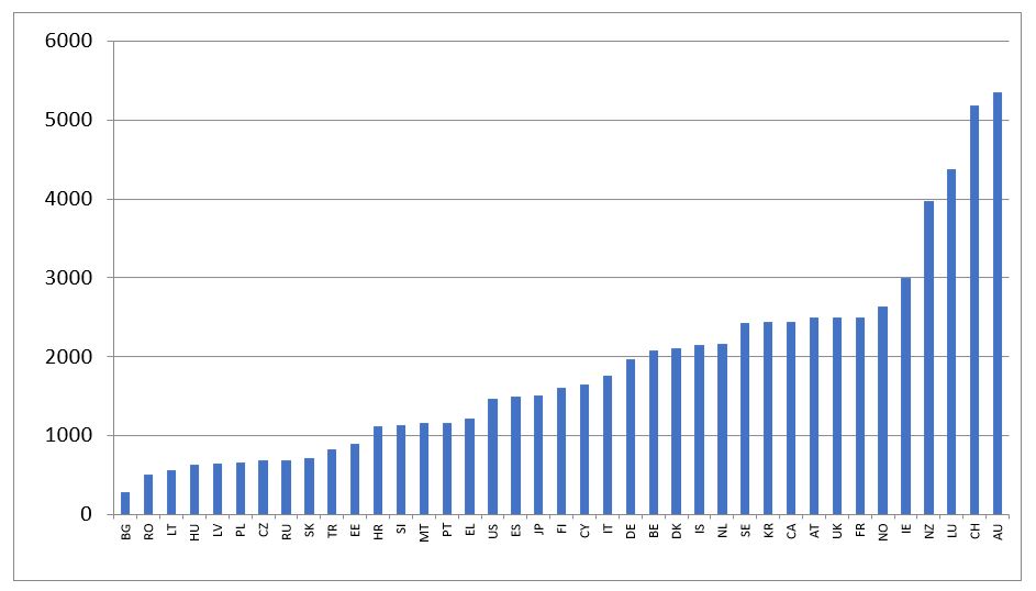
Figure 1: House price per square meter in 2016 (in euros)
A new data set called HouseLev put together by Jean-Charles Bricongne, Alessandro Turrini and Peter Pontuch fills the gap. It provides the average price per square meter of housing in 40 countries, from as far back in 1970 for most countries to the most recent available, generally 2017 or 2018.
The authors use two methods, top-down and bottom-up, with the latter intended to provide a check on the former or a back-up estimate when the top down method is not feasible due to missing data.
The top-down method computes the average price as the ratio of the total value of dwellings and associated land to the total floor area of dwellings. The total value of dwellings and land (‘the numerator’) is generally taken from the national income accounts of countries; the total floor area (‘the denominator’) is from the census data of countries. Divide one by the other and, presto, you have the average price of a house.
So now we have an answer to the first question posed earlier. As shown in Figure 1, it turns out that the cost of the average house price in the United States is under 1500 euros per square meter and over 5000 euros per square meter in Australia. (For metrically-challenged U.S.-centric readers, that’s about $150 per square foot in the United States.)
Of the countries in the data set, houses in Bulgaria are the cheapest at under 300 euros per square meter and the most expensive houses are in Hong Kong (SAR)—prices there are literally off the charts—nearly 30,000 euros per square meter!—and hence not shown in Figure 1.
How reliable are these estimates? Here’s where the bottom-up approach comes in. The authors have painstakingly gone through the websites of real estate agents and collected the data on sales offers in different locations. These data are then aggregated up to give a country-level average. Reassuringly, for most countries, the top-down approach and the bottom-up approach give similar estimates of house prices—the median difference in only 7 percent and the biggest difference is 12 percent.
Figure 2: Years of income required to purchase a house in 2016
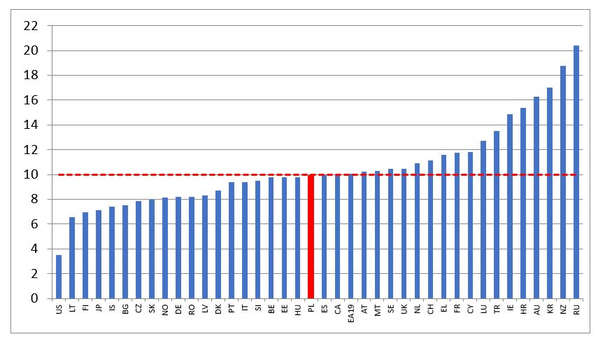
Figure 2 shows that it takes under 4 years of average income to buy a house of average size in the United States and over 16 years in Australia. The median across countries is 10 years.
The creators of the data set also looked into whether high ratios of house prices to incomes can signal a correction in house prices. They find that if the ratio is greater than 10, there is concrete risk of a significant downward correction of house prices in the following three years (see their paper, Bricongne et al. (2019), for the details).
Q&A with the creators:
Q. Is the data set publicly available?
A. The data set that covers forty countries is publicly available with detailed annexes of prices in levels in national currencies, in euros, in PPP (purchasing power parity) and with price to income ratios, in the annex of the European Commission Discussion Paper available at the following link: https://ec.europa.eu/info/sites/info/files/economy-finance/dp101_en_houselev.pdf
Q. You mentioned plans to extend the dataset to the regional level? What is the status of this work?
A. Work is ongoing in the Commission, with first results covering all EU countries expected for Autumn 2020. The Commission, Banque de France and the OECD are cooperating and interacting on these efforts. Initial raw results are available already at a basic regional level for the EU27 countries (the so-called NUTS2 level), with time series broadly spanning the 2010s.
Since national accountants quite rarely publish data at a local (NUTS3) level, the principal source to produce regional house prices in levels is the one based on web scraping, as well as aggregates from administrative data. The main issues that we encountered with the construction of sub-national price levels is comparability, which is why we focus mainly on improving stratification algorithms and refining our data on housing stocks, incorporating also satellite data.
Q. Will the data set be kept updated on a regular basis? By whom?
A. The dataset will be updated at least annually by the European Commission with Banque de France also contributing to possibly expanding the country coverage. The intent is to give access to the dataset to all potential users. The dataset will initially be accessible at the ‘browsable’ website of the REFINE network (real estate finance and economics network: https://www.institutlouisbachelier.org/en/programme/refine-real-estate-finance-and-economics-network-2/) but other solutions are also being considered.
Q. Has there been any reaction to your estimates (e.g. some validation from country authorities or realtors; anyone challenging your estimates)?
A. HouseLev is a database of estimates: these are not official statistics and they have not been validated neither by national statistical authorities or Eurostat nor by realtors. The estimates have been constructed with the objective of reliability, transparency and comparability, keeping in mind that full comparability is a tremendous challenge for non-homogenous objects such as dwellings. To get estimates as comparable as possible, a common concept of floor area is adopted (“useful floor area”). When possible, comparisons are made on the basis of more than one methodology for computing average prices per square meter.
The data have been shared with EU Member States and used by different institutions: central banks, ministries of finance, academics. A number of comments have been received by experts in the fora where preliminary versions of the dataset have been presented (European Commission, ECB, Banque de France, Paris Dauphine, OECD ACPR—the French Supervisor for banks and insurance companies). On a few occasions, the feedback has helped improving the estimates for some countries or to better qualify the results. Such feedback is being continuously used to incrementally improve the data methodology country by country.
Global Housing Watch Newsletter: February 2020
A remarkable new data set constructed by Jean-Charles Bricongne, Alessandro Turrini and Peter Pontuch allows direct comparison of house prices across countries—illustrating big differences in how many years of income it takes to buy a house—and provides suggestive evidence of when house prices may be at risk of correction. Prakash Loungani summarizes the data set and poses a few queries to its creators.
Posted by at 10:23 AM
Labels: Global Housing Watch
Subscribe to: Posts