


Monday, October 8, 2018
Fun Facts about the Nobel Prize
Mark J. Perry summarizes the 10 fun facts about the Nobel Prize:
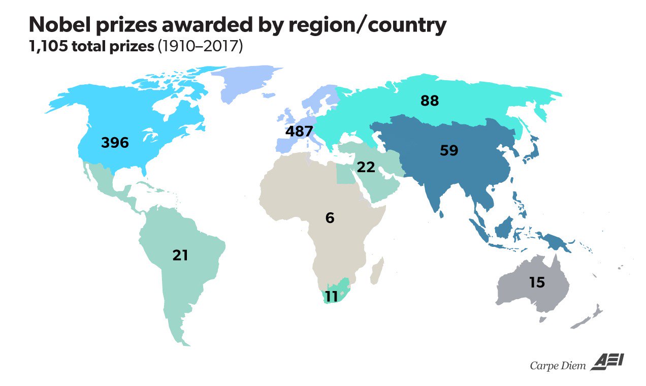
1. Western Countries Dominate Nobel Awards. […] a) the US and Canada (403 awards) and b) Western Europe (495 awards) together represent the vast majority of the 1,107 country affiliations associated with Nobel laureates, and more than 81% of the total number of laureates since 1901.
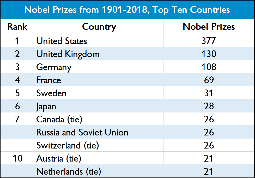
2. Top Ten Nobel-Winning Countries. […] The United States is by far the world’s leading country for receiving Nobel Prizes with an astonishing 377 individual laureates over the last 118 years (and 41.7% of all 904 awards), which is almost three times more than the second-highest ranked country — the United Kingdom, with 130 awards (see table above).
3. Latin America, Asia, Africa, and the Middle East together account for only 116 Nobel Prizes by country in total (10.5% of the 1,107 total), even though those areas together represent about 85% of the world’s population.
4. Asia. Laureates in Asia alone have been awarded 57 Nobel prizes, or 5.1% of the total prizes by country affiliation with nearly 55% of the world’s population. Nobel Prizes for Japanese laureates (28) represent close to half of all Asian awards, followed by India (1o) and China (8).
5. Middle East. Countries in the Middle East have received 22 Nobel Prizes, with more than half (12) of the awards going to Israeli laureates.
6. Africa is the region of the world with the fewest Nobel Prizes – only 17 in total, and only 7 outside of South Africa, even though Africa has a population of about 1 billion.
7. Jewish Nobel Laureates. Interestingly, Jews and people of Jewish descent represent less than 0.20% of the world’s population, but they represent more than 22% of all Nobel laureates (203 out of 904).
8. Nobel Laureates by Gender. Men have been awarded 847 Nobel Prizes compared to only 51 prizes awarded to female laureates.
9. Research Affiliations of Nobel Laureates. The table [below] shows the top ten research affiliations of Nobel laureates at the time of the announcement.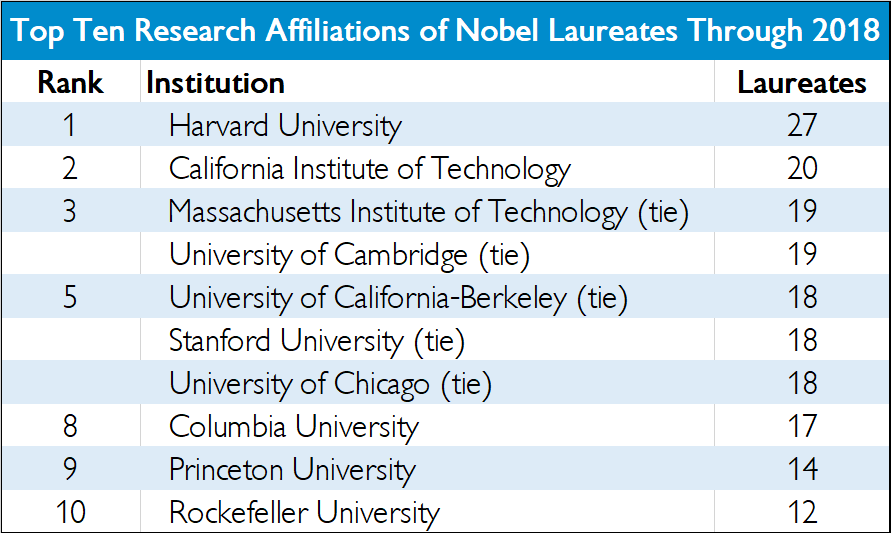
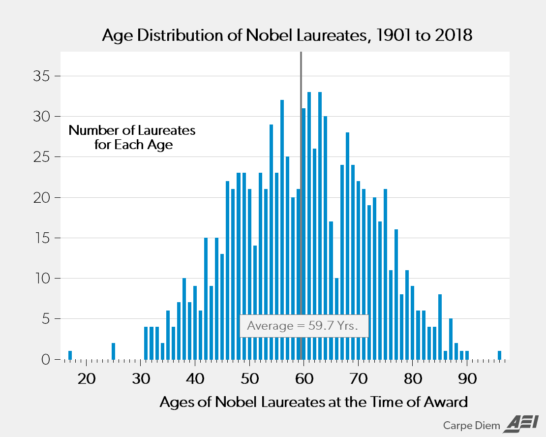
10. Nobel Prizes by Age. […] The chart below shows the age distribution of the 904 Nobel laureates, whose average age was 58.7 years old when the prize was awarded. By individual age, there are more laureates who received a Nobel Prize at age 61 or 63 years (33 individuals for each age) than any other age, followed by ages 56 years (32 laureates) and 60 years (31 laureates).
Mark J. Perry summarizes the 10 fun facts about the Nobel Prize:
1. Western Countries Dominate Nobel Awards. […] a) the US and Canada (403 awards) and b) Western Europe (495 awards) together represent the vast majority of the 1,107 country affiliations associated with Nobel laureates, and more than 81% of the total number of laureates since 1901.
2. Top Ten Nobel-Winning Countries.
Posted by at 10:00 PM
Labels: Profiles of Economists
Friday, October 5, 2018
Finance and pollution
From VOXEU:
“The environmental Kuznets hypothesis predicts that pollution will increase at early stages of development but then decline once a country surpasses a certain income level. This column examines how banks and stock markets affect the mechanisms behind this hypothesis. Industries which pollute relatively more for technological reasons generate relatively more carbon dioxide in countries with expanding credit markets, whereas stock markets have the exact opposite effect. For middle-income countries in particular, where carbon dioxide emissions may have increased linearly during the development process, stock markets could play an important role in making future growth greener.”
From VOXEU:
“The environmental Kuznets hypothesis predicts that pollution will increase at early stages of development but then decline once a country surpasses a certain income level. This column examines how banks and stock markets affect the mechanisms behind this hypothesis. Industries which pollute relatively more for technological reasons generate relatively more carbon dioxide in countries with expanding credit markets, whereas stock markets have the exact opposite effect. For middle-income countries in particular,
Posted by at 9:02 AM
Labels: Energy & Climate Change
Housing View – October 5, 2018
On cross-country:
- World’s top 10 most at-risk housing markets – Global Property Guide
- The Cities Around the World Most at Risk of Property Bubbles – Bloomberg
- Housing Crises – Federal Reserve Bank of St. Louis
- Global Residential Cities Index – Q2 2018 – Knight Frank
On the US:
- Brief Thoughts on Housing Supply and Policy – MIT Center for Real Estate
- ‘The Renters Strike Back’ – Brookings
- Unlocking Amenities: Estimating Public-Good Complementarity – NBER
- An Examination of the Link between Urban Planning Policies and the High Cost of Housing and Labor – Institute for International Economic Policy
- Housing Stability and Family Health: Five Things to Know – Federal Reserve Bank of San Francisco
- Housing Market Slows, as Rising Prices Outpace Wages – New York Times
- The Hot Property That’s Next on Tech’s Agenda: Real Estate – New York Times
- Dallas strikes it rich with rising property prices – Financial Times
- Mortgage Market Design: Lessons from the Great Recession – Brookings
- How vacation homes went from private escape to investment opportunities – Curbed
- America’s Affordable Housing Crisis Isn’t Just Hitting Cities – Huffington Post
- How Will Artificial Intelligence Shape Mortgage Lending? – Fannie Mae
On other countries:
- [Canada] British Columbia Cracks Down on Dirty Money in Real Estate – Bloomberg
- [Denmark] Housing Summit: Future Housing Market and Urban Development in the Capital Region of Denmark – Copenhagen Economics
- [Germany] A look into German housing markets: A bubble call? – Sage Journal
- [Ireland] Thousands march on Irish parliament in growing housing shortage protest – Reuters
- [Italy] House prices in local markets in Italy: dynamics, levels and the role of urban agglomerations – Bank of Italy
- [Mexico] Empty houses across North America: Housing finance and Mexico’s vacancy crisis – Urban Studies
- [Spain] Organisations and political groups reach an agreement to allocate 30% of all new homes as protected housing – Info Barcelona
- [Thailand] Thailand to Impose Mortgage Curbs to Tackle Speculation – Bloomberg
- [United Kingdom] What a no-deal Brexit could mean for London property prices – Global Property Guide
- [United Kingdom] London stamp duty take hits record £4.9bn even as sales fall – Financial Times
- [United Kingdom] May Plans to Hike U.K. Property Tax for Foreign Buyers – Bloomberg
- [United Kingdom] New tax on foreign home buyers to help rough sleepers, PM says – BBC
- [United Kingdom] Social Housing: Evidence Review – University of York

Photo by Aliis Sinisalu
On cross-country:
- World’s top 10 most at-risk housing markets – Global Property Guide
- The Cities Around the World Most at Risk of Property Bubbles – Bloomberg
- Housing Crises – Federal Reserve Bank of St. Louis
- Global Residential Cities Index – Q2 2018 – Knight Frank
On the US:
- Brief Thoughts on Housing Supply and Policy – MIT Center for Real Estate
- ‘The Renters Strike Back’ – Brookings
- Unlocking Amenities: Estimating Public-Good Complementarity – NBER
- An Examination of the Link between Urban Planning Policies and the High Cost of Housing and Labor – Institute for International Economic Policy
- Housing Stability and Family Health: Five Things to Know – Federal Reserve Bank of San Francisco
- Housing Market Slows,
Posted by at 5:00 AM
Labels: Global Housing Watch
Thursday, October 4, 2018
Why economy watchers obsess over the U.S. monthly jobs report
From an new LSE Business Review article by Ken Fireman:
“It is an ingrained monthly ritual for U.S. economy mavens: staring intently at a computer screen or smartphone on the first Friday of the month as the clock ticks down to 8:30 a.m. Eastern time, the moment when the Labor Department releases its jobs report for the previous month.
The two numbers that draw the headlines are those that report how many jobs the U.S. economy created (or lost) and what percentage of the workforce is unemployed. The results can shape perceptions of the world’s largest economy, influence policymakers’ choices and drive investment decisions, SAGE Business Researcher freelance correspondent Victoria Finkle writes. The report is considered so market-sensitive that journalists covering it are literally locked in a room and cut off from communicating with the outside world until the instant of the release time.
“What’s codified into a couple of small numbers is a lot of knowledge about where the economy is and where the economy is going,” Michael Farren, a research fellow at George Mason University’s Mercatus Center, told Business Researcher.
But those top-line numbers are just the tip of a mountain of valuable statistical material contained in the 40-page report, Finkle writes in her account of the monthly exercise. And the data that lurk in the recesses of the report can lend texture and detail to our understanding of the economy and provide deep insights into how policymakers at the Federal Reserve and other institutions will move in the future.
Take, for example, the unemployment rate. The headline number, known as the U-3 rate from its Labor Department code, measures the percentage of the total labour force that is jobless and actively seeking work. It’s closely watched because it is tied to both halves of the Fed’s so-called dual mandate of maximising employment while maintaining price stability, Finkle writes.
But U-3 is just one way to view unemployment. It captures only those who are jobless but still looking for work; people who are so discouraged by their job prospects that they’ve simply given up searching are not counted among the unemployed in this measure. So the quants in the department’s Bureau of Labor Statistics calculate two more rates. One, known as U-5, captures those jobless and looking, plus “marginally attached” workers – those who have looked for work sometime in the past year, but not recently. U-5 is a favourite of Treasury Secretary Steven Mnuchin, who has said U-3 doesn’t provide a complete picture of the labour market. “Currently, excessive influence appears to be placed by U.S. policymakers on one metric,” he said last year, referring to the headline unemployment rate.
A second alternative measure, known as U-6, encompasses everyone unemployed and looking, plus the marginally attached – and those who are working, but in a part-time job when they would rather work full-time. This metric, sometimes known as the underemployment rate, also has its fans; it was often cited by former Fed Chair Janet Yellen during her tenure at the helm of the central bank.
Finally, the report contains data on the percentage of those unemployed who have been out of work for 27 weeks or more. Economists watch this measure, known as the long-term jobless rate, because the longer people remain out of work, the harder it becomes for them to become re-employed, Finkle writes.
No matter which unemployment rate one prefers, a constant factor in the equation is the size of the labour force, the sum of all employed and unemployed workers. And economists pay close attention to another measure in the monthly jobs report that bears directly upon the size of the labour force: the rate of participation. It has been declining in recent years – more than 3 percentage points in the past decade – as the large baby boomer generation edges into retirement, a “skills gap” widens between available workers and available jobs and opioid addiction and higher prison rates take their toll.
The monthly report also tracks a number that has been an enduring puzzle: workers’ earnings. As the economy recovered from the 2007-09 recession and the various unemployment rates fell, standard economic theory suggested that wages should rise more or less in tandem, as a stronger economy generated more demand for workers. The fact that this hasn’t happened has left many economists scratching their heads.
Each measure in the jobs report offers one piece of a puzzle that economists, money managers and other decision-makers use to better understand where the economy is headed, Finkle writes.
“If you see that employment grows by 200,000 or wages are growing by 2.5 percent year-over-year, what does that mean?” the Mercatus Center’s Farren told Business Researcher. “When you aggregate [survey data] across all businesses, that’s telling you something about the state of the economy in general. There’s a lot that’s influenced downstream by these relatively limited numbers.”
From an new LSE Business Review article by Ken Fireman:
“It is an ingrained monthly ritual for U.S. economy mavens: staring intently at a computer screen or smartphone on the first Friday of the month as the clock ticks down to 8:30 a.m. Eastern time, the moment when the Labor Department releases its jobs report for the previous month.
The two numbers that draw the headlines are those that report how many jobs the U.S.
Posted by at 9:29 AM
Labels: Macro Demystified
Monday, October 1, 2018
Measuring unfair inequality
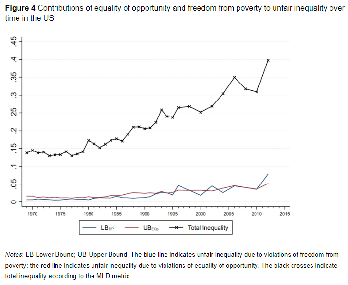
From a new VOX post:
“Rising income and wealth inequality have come into sharp focus since the Global Crisis. Using US and European data, this column explores the factors contributing to unfair inequality, focusing on equality of opportunity and freedom from poverty. The results show that unfair inequality is greater in the US than anywhere in Europe, and that it has been increasing over time. The findings also show that relying solely on measures of equality of opportunity will severely underestimate unfair inequality.”
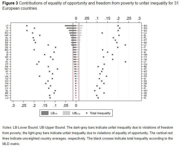
“How much of the unfairness of inequality can be attributed to its two components – equality of opportunity and freedom from poverty? We cannot cleanly allocate all unfair inequality to either freedom from poverty or equality of opportunity, since they are partly overlapping. But we can derive upper and lower bounds (technical details are provided in Hufe et al. 2018). As documented in Figures 3 and 4, our baseline results are driven by equality of opportunity and freedom from poverty in about equal proportions. But, what this does suggest is that relying solely on equality of opportunity as a gauge will grossly understate the degree of unfairness in a society.”
From a new VOX post:
“Rising income and wealth inequality have come into sharp focus since the Global Crisis. Using US and European data, this column explores the factors contributing to unfair inequality, focusing on equality of opportunity and freedom from poverty. The results show that unfair inequality is greater in the US than anywhere in Europe, and that it has been increasing over time. The findings also show that relying solely on measures of equality of opportunity will severely underestimate unfair inequality.”
Posted by at 9:05 PM
Labels: Inclusive Growth
Subscribe to: Posts