


Sunday, August 31, 2014
House Prices in Norway
“House prices in Norway rose strongly in recent years but stabilized in late 2012. Various factors have been contributing to rising house prices, including high income and wage growth, immigrant inflows, and supply constraints. Nevertheless, there are signs of overvaluation with a sustained increase in the price-to-income ratio and a large deviation in the price-to-rent ratio from its historical average. Staff’s updated estimates on house price valuation gaps, based on the three measures of valuation used in the background papers for the 2013 Nordic Regional Report and Norway Article IV report, suggest a slight correction in the degree of overvaluation in 2013, but prices remain above equilibrium by varying degrees according to different estimates,” says the IMF’s new annual economic report on Norway.
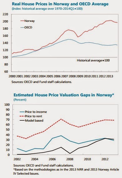
“House prices in Norway rose strongly in recent years but stabilized in late 2012. Various factors have been contributing to rising house prices, including high income and wage growth, immigrant inflows, and supply constraints. Nevertheless, there are signs of overvaluation with a sustained increase in the price-to-income ratio and a large deviation in the price-to-rent ratio from its historical average. Staff’s updated estimates on house price valuation gaps, based on the three measures of valuation used in the background papers for the 2013 Nordic Regional Report and Norway Article IV report,
Posted by at 1:55 PM
Labels: Global Housing Watch
Wednesday, August 27, 2014
Are You Cut Out To Be A Macroeconomist? A Simple Test
Try this at home. The chart below shows you the relationship between unemployment and output (to be precise, it is the relationship between the change in unemployment and output growth). The chart is automatically updated, starting with the relationship as it appeared in 1948 to 1963, and then adding 10 additional years at a time to bring it all the way to the present. (You can also click on this link to see these charts: Okun’s Law Over Time.) Now here’s the first question on the test: Do you think the relationship shown in these charts has remained strong and stable over time?
Here’s the link to another macroeconomic relationship, this one between unemployment and inflation. Same deal: first you see the relationship over the 1948 to 1963 period and the charts that follow add 10 years at a time. (You can also click on this link to see these charts: Phillips Curve Over Time.) Second question on the test: Do you think the relationship shown in these charts has remained strong and stable over time?
If you are suspecting a trick you are right. To the lay person, it probably seems that the first relationship, known as Okun’s Law, is strong and stable and the second relationship, known as the Phillips Curve, is weak and unstable. But macroeconomists actually worry a lot that Okun’s Law is dead. And—using special goggles known as ‘econometrics’—they are able to see the Phillips Curve where the lay person may just see a cloud.
Robert Gordon, a renowned macroeconomist, for example has proclaimed the demise of Okun’s Law and noted that, in contrast, the Phillips Curve is ‘alive and well’. This is what keeps macroeconomics interesting: things may not be what they seem. (For what it’s worth, I think that Okun’s Law is alive and well and that the Phillips Curve is being kept alive with artificial resuscitation—but then I’m closer to a lay person than to a renowned macroeconomist.)
Try this at home. The chart below shows you the relationship between unemployment and output (to be precise, it is the relationship between the change in unemployment and output growth). The chart is automatically updated, starting with the relationship as it appeared in 1948 to 1963, and then adding 10 additional years at a time to bring it all the way to the present. (You can also click on this link to see these charts: Okun’s Law Over Time.) Now here’s the first question on the test: Do you think the relationship shown in these charts has remained strong and stable over time?
Posted by at 6:13 PM
Labels: Inclusive Growth, Macro Demystified
Tuesday, August 12, 2014
House Prices in the Philippines
“In Q4:2013, prices of mid- and high-end condominiums in upscale areas of metro Manila (only available price series) rose by 13 percent, y/y, similar to growth rates that prevailed prior to the GFC. However, in real terms, condo prices remain below their peak that prevailed prior to the Asian financial crisis. This likely reflects in part the large supply increase in this market segment in recent years. In fact, according to the official Philippine Housing Industry Plan for 2012‒30, supply of units in the mid- and high -cost segments of the housing market is adequate, while the low-end of the market is characterized by severe shortages. Despite the recent price increases, residential price-to-rent ratios have remained relatively stable at around 14 percent,” says the IMF’s latest report on the Philippines.
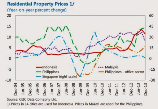
“In Q4:2013, prices of mid- and high-end condominiums in upscale areas of metro Manila (only available price series) rose by 13 percent, y/y, similar to growth rates that prevailed prior to the GFC. However, in real terms, condo prices remain below their peak that prevailed prior to the Asian financial crisis. This likely reflects in part the large supply increase in this market segment in recent years. In fact, according to the official Philippine Housing Industry Plan for 2012‒30,
Posted by at 5:46 PM
Labels: Global Housing Watch
House Prices in China
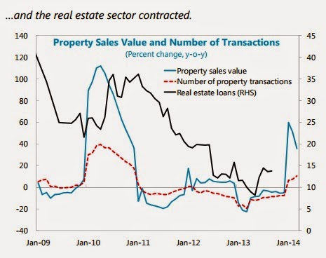
The real estate sector “(…) has shown growing signs of imbalances and activity has softened in 2014. The challenge is to allow for the necessary correction while preventing an excessively sharp slowdown. The contribution of real estate and construction to growth has been rising; last year, it accounted directly for 12.8 percent of value added, and about 33 percent if upstream and downstream sectors are included. Residential real estate is marked by substantial regional differentiation. Large cities have enjoyed favorable demand conditions—reflecting both underlying and speculative demand—and prices show signs of overvaluation relative to fundamentals, despite measures aimed at restricting speculative demand. In contrast, many smaller cities have experienced oversupply as local governments promoted large-scale development to boost growth and used land sales to finance local government spending. Supply seems to have outpaced demand in many areas as evidenced by muted price increases and rising inventories. The commercial real estate market appears to be in oversupply in both smaller and bigger cities,” according to the latest IMF report on China.
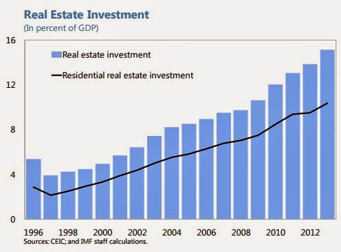
The real estate sector “(…) has shown growing signs of imbalances and activity has softened in 2014. The challenge is to allow for the necessary correction while preventing an excessively sharp slowdown. The contribution of real estate and construction to growth has been rising; last year, it accounted directly for 12.8 percent of value added, and about 33 percent if upstream and downstream sectors are included. Residential real estate is marked by substantial regional differentiation.
Posted by at 8:43 PM
Labels: Global Housing Watch
Subscribe to: Posts