Showing posts with label Macro Demystified. Show all posts
Saturday, May 5, 2018
Spring 2018 Journal of Economic Perspectives is Online
From a new post by Timothy Taylor:
“I was hired back in 1986 to be the Managing Editor for a new academic economics journal, at the time unnamed, but which soon launched as the Journal of Economic Perspectives. The JEP is published by the American Economic Association, which back in 2011 decided–to my delight–that it would be freely available on-line, from the current issue back to the first issue. Here, I’ll start with Table of Contents for the just-released Spring 2018 issue, which in the Taylor household is known as issue #124. Below that are abstracts and direct links for all of the papers. I will blog more specifically about some of the papers in the next week or two, as well.”
From a new post by Timothy Taylor:
“I was hired back in 1986 to be the Managing Editor for a new academic economics journal, at the time unnamed, but which soon launched as the Journal of Economic Perspectives. The JEP is published by the American Economic Association, which back in 2011 decided–to my delight–that it would be freely available on-line, from the current issue back to the first issue.
Posted by at 1:15 PM
Labels: Macro Demystified
Tuesday, May 1, 2018
How much does infrastructure boost an economy?
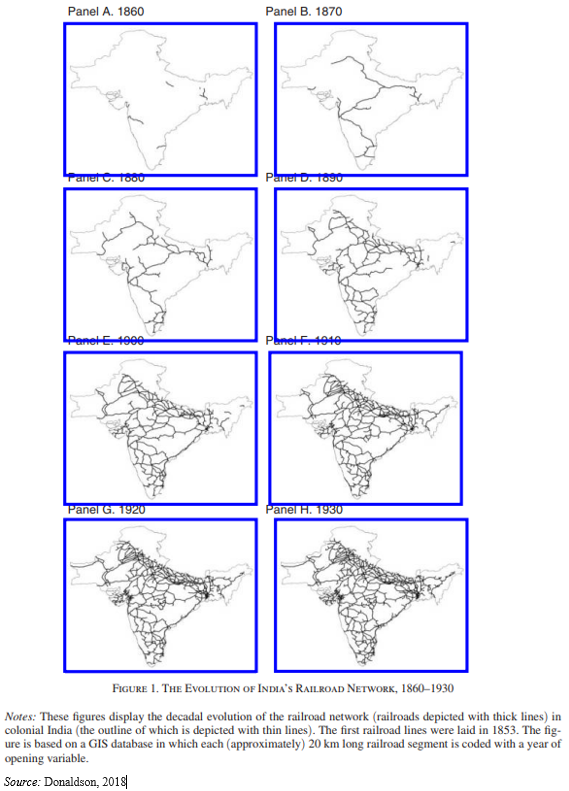
A new post by Peter Dizikes summarizing David Donaldson’s new paper on how railroads helped India trade and grow: “railroads fostered commerce that raised real agricultural income by 16 percent.”
“Donaldson’s paper on the subject, “Railroads of the Raj: Estimating the Impact of Transportation Infrastructure,” just published in the American Economic Review, may also speak to the importance of infrastructure more broadly. After all, as he notes in the paper, about 20 percent of World Bank lending in the developing world goes to infrastructure projects. And in the United States, debate rolls on about the value of building and refurbishing America’s roads, bridges, railroads, ports, and airports.”
“And while every country is different, and circumstances change over time, Donaldson’s research suggests that the growth India experienced as its railroads grew was specifically the result of increased trade, a general finding that could be applied to other countries and other eras.”
A new post by Peter Dizikes summarizing David Donaldson’s new paper on how railroads helped India trade and grow: “railroads fostered commerce that raised real agricultural income by 16 percent.”
“Donaldson’s paper on the subject, “Railroads of the Raj: Estimating the Impact of Transportation Infrastructure,” just published in the American Economic Review, may also speak to the importance of infrastructure more broadly. After all, as he notes in the paper,
Posted by at 11:39 AM
Labels: Inclusive Growth, Macro Demystified
El-Erian on What’s Wrong with Economics
From a new post by Mohamed A. El-Erian:
“[…] the reputation of mainstream economists has taken a beating in the last 10 years. The bulk of them failed to predict the 2008 crisis that almost tipped the global economy into a multiyear depression. They also didn’t foresee the aftermath.
Most made the mistake of treating the crisis as a cyclical shock and forecast a V-type growth snapback. They were prisoners of an excessive mean-reversion mindset: They acknowledged that growth was taking a huge hit due to severe financial dislocations, but they forecast that economic activity would bounce back strongly and inclusively.
Instead, the experience of advanced economies more closely resembled an “L,” in which they got stuck in a “new normal” characterized by a prolonged period of low and insufficiently inclusive growth.
The damage goes well beyond lost output, diminished consumer welfare, widespread economic insecurity and a worsening of the inequality of income, wealth and opportunity. The shortfalls fueled the politics of anger, along with a heightened mistrust of the establishment, institutions and expert opinion.
This, in turn, has diminished the credibility of economics. Meanwhile, many students have complained to me that the mainstream economics they are taught is divorced from real-world relevance. It is only a matter of time before the funding for economic research risks becoming a casualty.
Yet this huge failure has not been the result of ignorance about the limitations of the discipline, nor is it the consequence of a lack of new, disruptive ideas.
Here are some reasons for the erosion of the insights and predictive powers of mainstream economics:
- The proliferation of oversimplifying assumptions, including those that sideline many elements of real-world behaviors and interactions, in an effort to make models seem more “scientific.” This leads to overreliance on excessively abstract estimation techniques and approaches.
- Insufficient consideration of financial linkages and little allowance, if any, for the possibility that financial dislocations can disrupt the economy.
- Poor and grudging adoption of important insights from behavioral science, along with excessive hesitation to develop multidisciplinary approaches.
- An oversimplification of uncertainty and the ways it influences economic interactions.
- Overemphasis of equilibrium conditions and mean reversion, a trend that reduces the understanding of transitions, structural changes and tipping points.”
From a new post by Mohamed A. El-Erian:
“[…] the reputation of mainstream economists has taken a beating in the last 10 years. The bulk of them failed to predict the 2008 crisis that almost tipped the global economy into a multiyear depression. They also didn’t foresee the aftermath.
Most made the mistake of treating the crisis as a cyclical shock and forecast a V-type growth snapback. They were prisoners of an excessive mean-reversion mindset: They acknowledged that growth was taking a huge hit due to severe financial dislocations,
Posted by at 11:38 AM
Labels: Inclusive Growth, Macro Demystified
Tuesday, April 17, 2018
Economic Growth from Octavian to Obama
From HumanProgress by Marian L. Tupy:
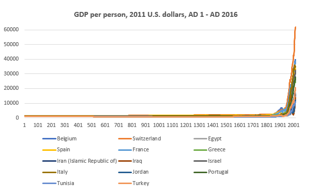
“Earlier this year, the Groningen Growth and Development Centre released a new edition of its Maddison Project Database, which provides information on global growth and income levels over the long run. The 2018 version of the data, first compiled by the late University of Groningen economics professor Angus Maddison, covers 169 countries up to the year 2016. Some information, dealing with parts of Europe and the Middle East, goes back to the time of Christ (or, for the secularly inclined, Rome’s first emperor, Octavian). It provides a stunning window on humanity’s struggle to generate and sustain rapid economic growth, until recent centuries ushered in the current Age of Abundance.”
“Angus Maddison, the British quantitative macroeconomic historian who died in 2010, spent his adult life estimating gross domestic product (GDP) figures for a growing range of countries over a lengthening period of time. In 1995, he published GDP estimates for 56 countries going back to 1820. In 2001, he extended his estimates to the beginning of the Christian Era. To some, Maddison’s numbers are “no more than educated guesses.” To others, they are “fictions, as real as the relics peddled around Europe in the Middle Ages.” But, Maddison’s research served an important purpose. “In disputing his figures,” The Economist predicted, future “scholars would be inspired to provide their own.” And so it proved to be.”
“The Maddison Project started in March 2010, when a group of Maddison’s colleagues decided to continue the Briton’s work on measuring economic performance for different regions and time periods. The latest edition of the GDP data was five years in the making and while the numbers have changed, the economic growth trend lines have stayed the same. As in previous editions of the data, human economic history resembles a hockey stick, with a long straight shaft and an upward-facing blade. For thousands of years, economic growth was negligible (resembling that long straight shaft). At the end of the 18th century, however, economic growth and, consequently, the standard of living, started to accelerate in Great Britain and then in the rest of the world (resembling that upward-facing blade).”
“That the early data should be most readily available for the constituent parts of the Roman Empire and Mesopotamia is unsurprising, since documentary and archeological evidence from those two regions is plentiful. According to the researchers at GGDC, real or inflation adjusted income per person around the time of Octavian (63 BC – AD 14) varied from $1,546 in Italy to $973 in Spain. That amounts to between $4.2 and $2.7 per person per day. It is a testament to the unevenness of economic development that, over two millennia later, some countries are still stuck at those (and even lower) levels. In 2016, GDP per person in Burundi, Central African Republic, Democratic Republic of Congo, Liberia, Malawi and Niger was $692, $619, $836, $764, $950 and $906 respectively.”
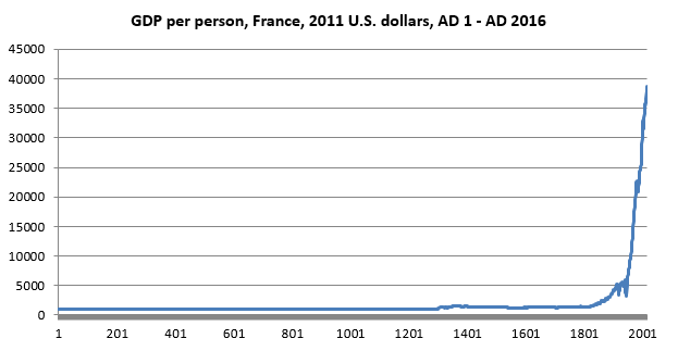
“Those African countries are outliers, of course. In most of the world, GDP per capita has risen dramatically, especially over the last two centuries. To get a sense of how recent and unprecedented the Age of Abundance is, consider France. In AD 1, GDP per person in the Roman province of Gaul was $1,050 – and that’s where it remained for the next 13 (yes, thirteen) centuries. During the first half of the 14th century, however, French incomes rose by some 50 percent, reaching a high of $1,553 in 1355. Why?”
“The end of the Medieval Warm Period in the late 13th century led to cooler weather and higher rainfall. Harvests shrunk and famines proliferated (e.g., 1304, 1305, 1310, 1315–1317, 1330–34 and 1349–51). To make matters much worse, the Black Plague (1347-1351) wiped out between 75 and 80 percent of those French who survived the climate change. Curiously, the two catastrophes had a salutary effect on both the economic and institutional developments in Western Europe. Abundance of land and agricultural tools seemed to have increased productivity of the surviving peasants, while labor shortages encouraged the lower classes to demand better treatment from their feudal overlords. As a consequence, serfdom gradually disappeared from the region, although it continued to persist in Eastern Europe, where the Black Plague was, due to lower population density, much less deadly.”
“As the population of Western Europe recovered, incomes waxed and waned, neither falling to their pre-plague levels, nor rising above their mid-14th century maximum. Thus, as late as 1831, the average GDP per person in France was only $1,534. Put differently, in the 18 centuries that separated the reigns of the first Roman Emperor and the last French king (Louis Phillipe), incomes rose by a paltry 50 percent. The Industrial Revolution, a British import, changed French fortunes considerably. Between 1831 and 1881, incomes rose by 100 percent ($3,067). As such, France made twice as much economic progress in 50 years as it did in the previous 1,800 years. In 2016, French GDP per capita stood at $38,758, meaning that a modern Frenchman is roughly-speaking 24 times better off (in real terms) than his ancestor 200 years ago. Remarkable.”
“France, of course, was not alone. Similar stories unfolded in other parts of the West. A year before the Declaration of Independence, American GDP per person stood at $1,883. By the time Barack Obama left office, U.S. GDP per person stood at $53,015 – a 27 fold increase. Today, abundance is no longer restricted to the West. As previously under-developed countries embraced industrialization and trade, they prospered. In 1978, when China started to reform its failing communist economy, its GDP per person stood at $1,583 (French levels in the early 1830s). By 2016, it rose to $12,320 (the French level in 1964). To put that progress in perspective, China grew as much in 38 years, as France did in 130 years. That, too, is noteworthy, for it demonstrates that, given correct policies, countries don’t have to reinvent the wheel. They can adopt ideas and technologies that took advanced countries millennia to develop and leapfrog from extreme poverty into the Age of Abundance within a couple of generations.”
From HumanProgress by Marian L. Tupy:
“Earlier this year, the Groningen Growth and Development Centre released a new edition of its Maddison Project Database, which provides information on global growth and income levels over the long run. The 2018 version of the data, first compiled by the late University of Groningen economics professor Angus Maddison, covers 169 countries up to the year 2016. Some information, dealing with parts of Europe and the Middle East,
Posted by at 3:31 PM
Labels: Inclusive Growth, Macro Demystified
Subscribe to: Posts


