Saturday, September 3, 2022
Apartment inflation
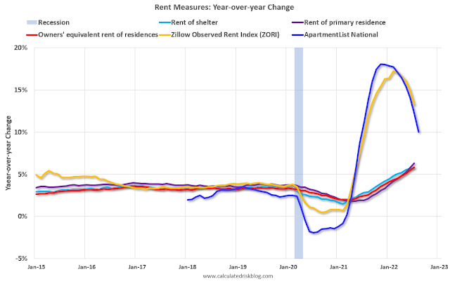
From the Grumpy Economist:
“This beautiful graph comes from calculatedriskblog.com. (Courtesy Andy Atkeson who used it in a nice discussion of a great paper by Ivan Werning at the Minneapolis Fed Foundations of Monetary Policy conference.)
The central lines that don’t move so much are the average rent. This is the quantity used by the Bureau of Labor Statistics to compute the consumer price index. The blue and yellow lines are the rent of new leases.
The first thing this informs is the economic theory of “sticky prices.” Apartment rents are a classic “sticky price;” the rent is fixed in dollar terms for a year. So, landlords deciding how much rent to charge, and people deciding how much they’re willing to pay, balance rents now vs. higher rents in the future. If everyone believes that inflation will be 10% over the next year, then it makes sense to raise the rent 5% now, and to pay the 5% higher rent, because the savings at the end of the year balance the cost in the beginning. (Obviously, the economics are much more subtle than this, but you get the idea.) And Voila’, you see it.
The graph also says there is some predictability and nomentum to inflation. Inflation should not be a surprise to forecasters. If you see rents on new leases much above average rents, it’s a pretty good bet that average rents will be rising in the future! This kind of phenomenon may be under exploited in formal inflation forecasting.
And, on the continuing speculation whether inflation will go away with interest rates still substantially below current inflation, the graph does seem a leading indicator that the rational expectations model is winning.”
Posted by at 8:56 AM
Labels: Global Housing Watch
Subscribe to: Posts