Saturday, January 22, 2022
Chart of the day…. or century?
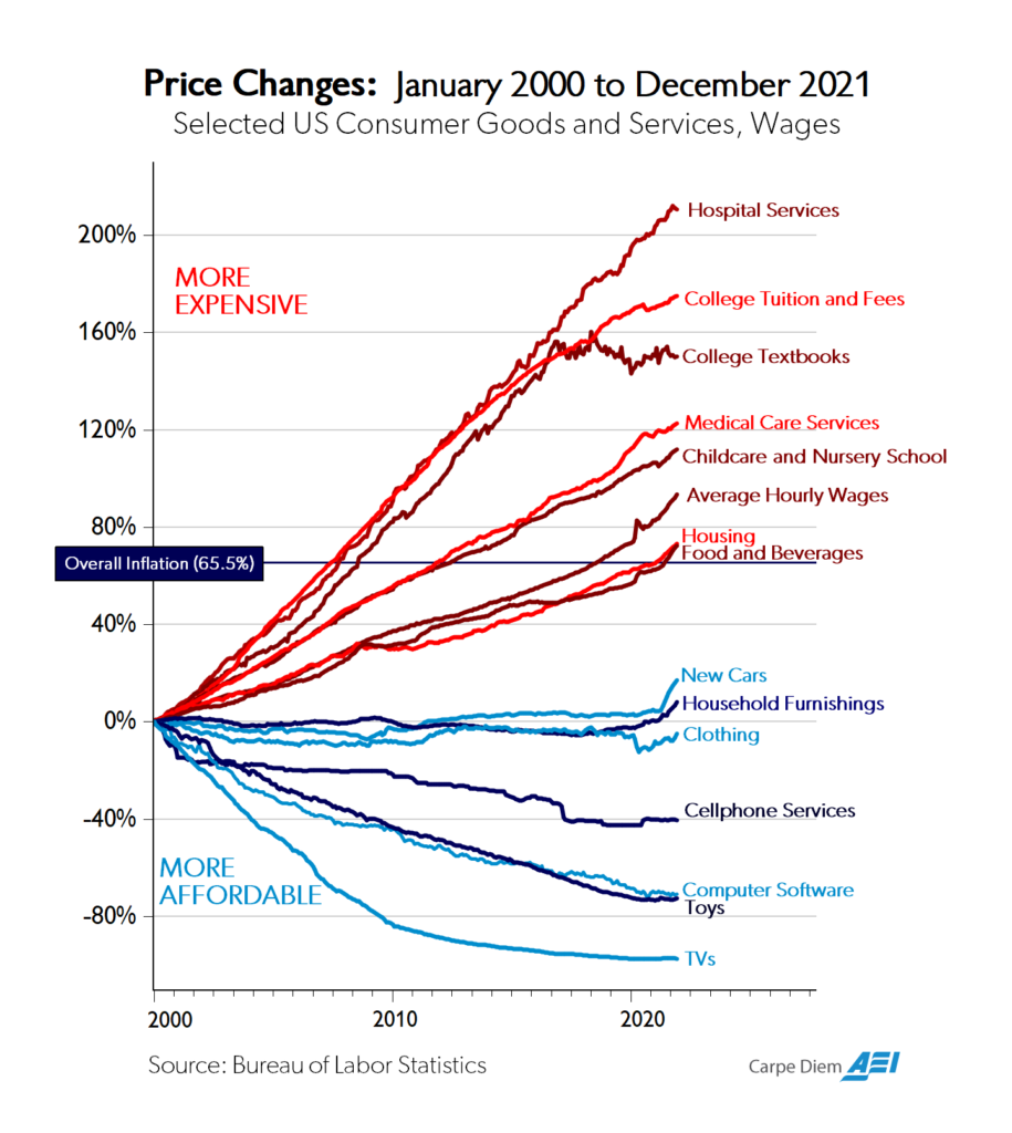
From Mark J. Perry (AEI):
“As I wrote in the summer of 2018 on CD, I’ve probably created and posted more than 3,000 graphics on CD, Twitter, and Facebook including charts, graphs, tables, figures, maps, and Venn diagrams over the last 16 years. Of all of those graphics, I don’t think any has gotten more attention, links, re-Tweets, re-posts, and mentions than previous versions of the chart above, which was once referred to as “the Chart of the Century.” Here are some examples of the attention that past versions of the chart above have gotten:
*Marketwatch has featured the chart twice here and here and made this comment “When this chart’s creator, econ professor Mark Perry and the man behind the Carpe Diem blog, first posted it on Twitter, it was hailed as “stunning” and “one of the most important charts about the economy this century.“
*Barry Ritholz has featured various versions of the chart three times on his Big Picture Blog here, here, and here.
*Bloomberg published an article in July 2018 titled “Chart of Century Gives Powell Gloomy Glimpse of Trade-War World,” with this opening:
A multi-colored graphic that’s made the rounds at the Federal Reserve hints at what Chairman Jerome Powell could face if President Donald Trump succeeds in throwing globalization into reverse: Higher prices for many goods and potentially faster inflation.
Plugged as possibly the chart of the century by economist and originator Mark Perry, it shows that prices of goods subject to foreign competition — think toys and television sets — have tumbled over the past two decades as trade barriers have come down around the world. Prices of so-called non-tradeables — hospital stays and college tuition, to name two — have surged.”
Posted by at 1:09 PM
Labels: Macro Demystified
Subscribe to: Posts