Showing posts with label Macro Demystified. Show all posts
Tuesday, May 9, 2017
Restarting Sub-Saharan Africa’s Growth Engine
From a new IMF Regional Economic Outlook on Sub-Saharan Africa
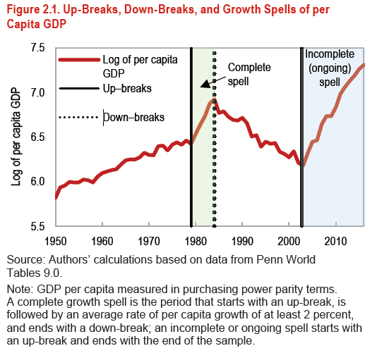
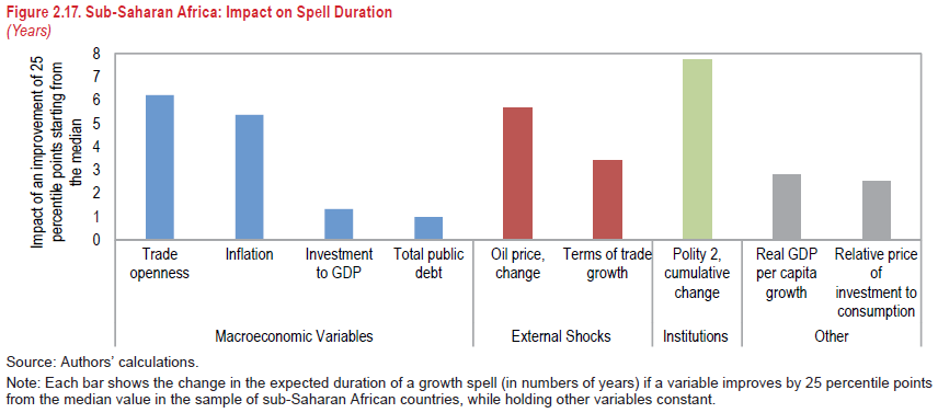
“After nearly two decades of strong growth, average economic activity in sub-Saharan Africa has decelerated sharply, against the backdrop of lower commodity prices, a less-supportive global environment, and, in the hardest-hit countries, a delayed policy response (Chapter 1). However, the full picture is more complex, with considerable heterogeneity across countries. Against this backdrop, two related questions arise: How can growth be revived in the hardest-hit countries? And for countries that are still growing fast, how can growth be sustained?
This chapter tries to answer these questions by examining the growth performance of sub-Saharan African countries through the lens of growth turning points and periods of sustained growth episodes using a sample containing data from 1950 to 2016.1 To that effect, the chapter first documents the stylized facts of growth turning points—defined here as growth accelerations (up-breaks) and decelerations (down-breaks)—and sustained growth episodes (growth spells) across the region and vis-à-vis the rest of the world. The chapter then examines the changes in both the external and domestic environment (including policies) that coincided with turning points in sub-Saharan Africa. Finally, the chapter investigates how some episodes of growth acceleration become periods of sustained growth, and what influences the duration of these episodes.”
Continue reading here.
From a new IMF Regional Economic Outlook on Sub-Saharan Africa
“After nearly two decades of strong growth, average economic activity in sub-Saharan Africa has decelerated sharply, against the backdrop of lower commodity prices, a less-supportive global environment, and, in the hardest-hit countries, a delayed policy response (Chapter 1). However, the full picture is more complex, with considerable heterogeneity across countries. Against this backdrop, two related questions arise: How can growth be revived in the hardest-hit countries?
Posted by at 3:14 PM
Labels: Macro Demystified
Tuesday, January 31, 2017
Okun’s Law and Phillips Curves in Asia
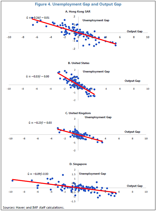
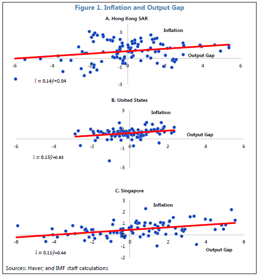
A nice paper comparing basic macroeconomic relationships in Hong Kong (SAR) and Singapore to those in the United States and the United Kingdom.
Continue reading here.
A nice paper comparing basic macroeconomic relationships in Hong Kong (SAR) and Singapore to those in the United States and the United Kingdom.
Continue reading here.
Posted by at 8:57 AM
Labels: Macro Demystified
Thursday, January 12, 2017
Decoupling of Emissions and GDP: Now you see it, now you don’t
There are conflicting claims about whether emissions growth and GDP growth have decoupled. My presentation today shows that some of this debate is due to a failure to distinguish cycles from trends: there is an Environmental Okun’s Law (a cyclical relationship between emissions and GDP) which often obscures the Environmental Kuznets Curve (the trend relationship between emissions and GDP).
My ongoing work casts relationships between emissions and economic growth in much simpler terms than is typically done in the climate change literature. My co-authors and I use the trend and cycle decomposition that is familiar to most economists, particularly macroeconomists. We then show that the cyclical relationship between emissions and real GDP—akin to an Okun’s Law, in the terminology of macroeconomists—obscures the trend relationship—the Kuznets Curve that is the focus of many papers in the climate change literature. Once the cyclical relationship is stripped away, the trends do show some evidence of decoupling in the richer nations, particularly in Europe.
We then apply the framework to take into account the effects of international trade. That is, we distinguish between production-based and consumption-based emissions. This makes a big difference to the results. Specifically, the evidence for decoupling among the top emitting countries gets much weaker, including for many countries in Europe.
There are conflicting claims about whether emissions growth and GDP growth have decoupled. My presentation today shows that some of this debate is due to a failure to distinguish cycles from trends: there is an Environmental Okun’s Law (a cyclical relationship between emissions and GDP) which often obscures the Environmental Kuznets Curve (the trend relationship between emissions and GDP).
My ongoing work casts relationships between emissions and economic growth in much simpler terms than is typically done in the climate change literature.
Posted by at 10:32 AM
Labels: Energy & Climate Change, Macro Demystified
Wednesday, December 21, 2016
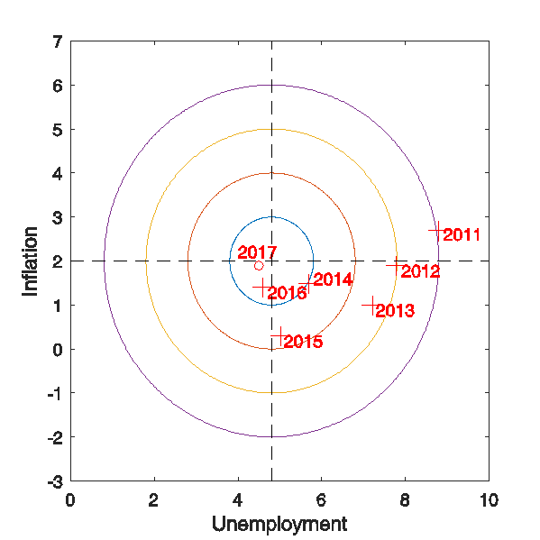
The Fed and the U.S. Economy: Hitting the Bull’s Eye?
Like Jim Hamilton, I like the visual device suggested by my friend and former colleague Charlie Evans (a.k.a. President Evans of the Chicago Fed) of using a bull’s eye to show where the economy is relative to the Fed’s likely targets. Jim’s latest update shows the U.S. economy moving back towards the bull’s eye.
Like Jim Hamilton, I like the visual device suggested by my friend and former colleague Charlie Evans (a.k.a. President Evans of the Chicago Fed) of using a bull’s eye to show where the economy is relative to the Fed’s likely targets. Jim’s latest update shows the U.S. economy moving back towards the bull’s eye.
Posted by at 7:26 AM
Labels: Macro Demystified
Monday, December 19, 2016
GDP Demystified
Posted by at 8:59 AM
Labels: Macro Demystified
Subscribe to: Posts
