Showing posts with label Macro Demystified. Show all posts
Thursday, March 22, 2018
How much people make
From the US Congressional Budget Office (CBO):
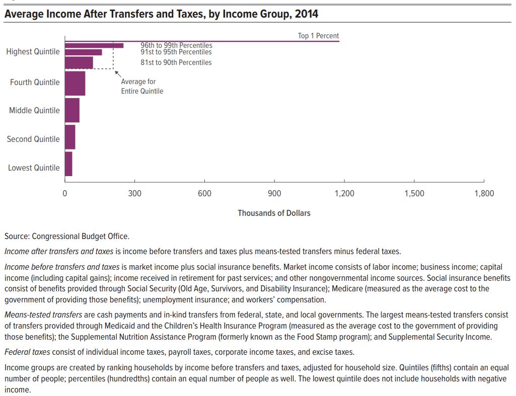
In 2014, household income was unevenly distributed: Households at the top of the income distribution received significantly more income than households at the bottom of the distribution. According to the Congressional Budget Office’s estimates:
- Average income among households in the lowest quintile (or fifth) of the income distribution was about $19,000.
- Average income among households in the highest quintile was about $281,000.
Furthermore, within the highest quintile, income was highly skewed toward the very top of the distribution: Average income among households in the bottom half of the highest quintile (the 81st to 90th percentiles) was about $151,000; average income among the 1.2 million households in the top 1 percent of the distribution was about $1.8 million.
Those amounts include social insurance benefits (such as benefits from Social Security and Medicare) but exclude the effects of governmental policies that directly affect the distribution of household income either through means-tested transfer programs or through the federal tax system.
Means-tested transfers are cash payments and in-kind benefits from federal, state, and local governments that are designed to provide assistance to individuals and families with low income and few assets. They include benefits from government assistance programs such as Medicaid and the Children’s Health Insurance Program (CHIP), the Supplemental Nutrition Assistance Program (SNAP, formerly known as the Food Stamp program), and Supplemental Security Income (SSI). Federal taxes consist of individual income taxes, payroll taxes, corporate income taxes, and excise taxes. Means-tested transfers and federal taxes cause household incomes to be more evenly distributed. In 2014, those transfers and taxes:
- Increased income among households in the lowest quintile by $12,000 (or more than 60 percent), on average, to $31,000.
- Decreased income among households in the highest quintile by $74,000 (or more than 25 percent), on average, to $207,000.
CBO has analyzed the distribution of household income and federal taxes on a recurring basis for more than 30 years. For this report, the agency focused on the distribution of household income in 2014 because that is the most recent year for which relevant data were available when the analysis began. In addition, CBO assessed trends in household income, means-tested transfers, federal taxes, and income inequality over a 36-year period, beginning in 1979 and ending in 2014.
Read the full report here.
From the US Congressional Budget Office (CBO):
In 2014, household income was unevenly distributed: Households at the top of the income distribution received significantly more income than households at the bottom of the distribution. According to the Congressional Budget Office’s estimates:
- Average income among households in the lowest quintile (or fifth) of the income distribution was about $19,000.
- Average income among households in the highest quintile was about $281,000.
Posted by at 3:11 PM
Labels: Macro Demystified
Monday, March 19, 2018
Creative Destruction, the Uber Effect, and the Slow Death of the NYC Taxi Cartel
HT: Carpe Diem. From the article “This Chart Shows the Slow Death of the NYC Yellow Taxi” by Nick Lucchesi:
“A new chart released this week shows that the New York City taxi cab is not only an endangered species but that its days are numbered. Today, there are 65 percent more ride-hailing trips than taxi trips in New York City (see chart above).
Genius employee and data-visual enthusiast Todd Schneider pulled from the reams of data released by the New York City Taxi & Limousine Commission each month that shows fares by car type — taxi or ride-hailing service. His analysis shows the tide has turned: At the end of 2017, all monthly ride-hailing pickups (Uber, Lyft, Juno, Via, Gett) numbered 15 million, while taxi pickups numbered less than 10 million. As use of yellow taxis (which primarily serve Manhattan) and green taxis (which primarily serve the other four boroughs) has been on the decline, there’s been a sharp increase in the use of ride-hailing apps.
The chart above shows the data behind one of the most dramatic changes in America’s largest city over the past five years. The way people in New York (tourists and locals alike) get around has flipped, and it doesn’t show any sign of stopping, according to Schneider’s analysis.”
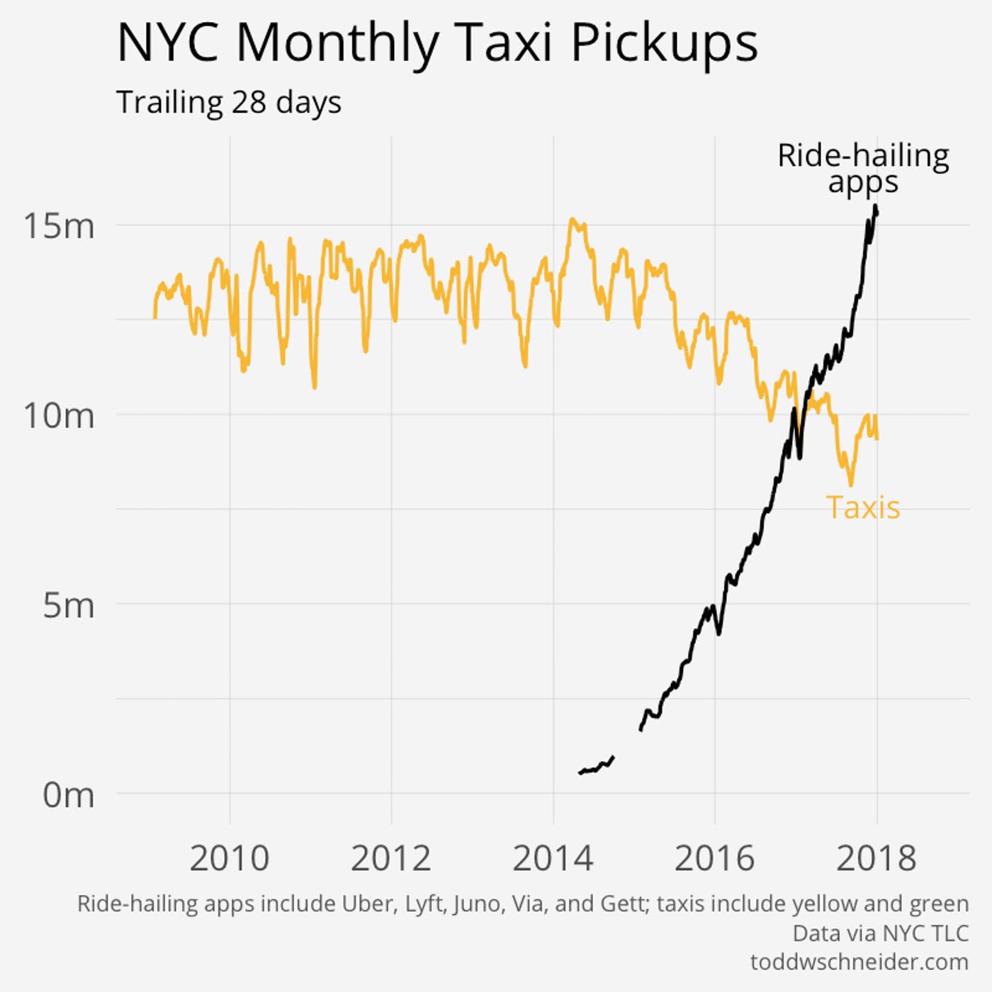
HT: Carpe Diem. From the article “This Chart Shows the Slow Death of the NYC Yellow Taxi” by Nick Lucchesi:
“A new chart released this week shows that the New York City taxi cab is not only an endangered species but that its days are numbered. Today, there are 65 percent more ride-hailing trips than taxi trips in New York City (see chart above).
Genius employee and data-visual enthusiast Todd Schneider pulled from the reams of data released by the New York City Taxi &
Posted by at 10:18 AM
Labels: Macro Demystified
Monday, March 12, 2018
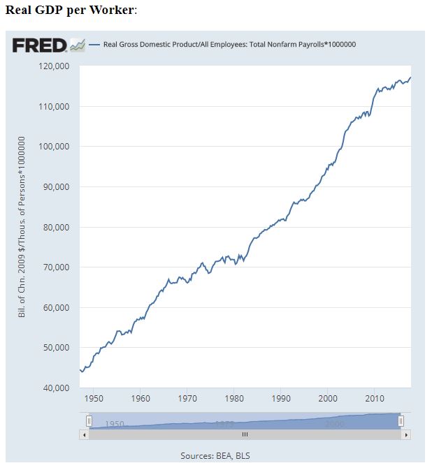
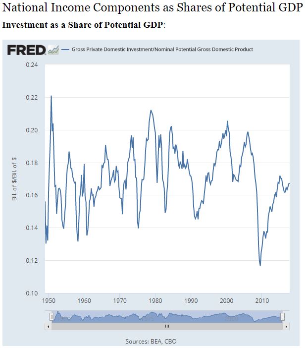
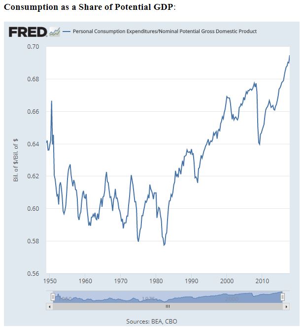
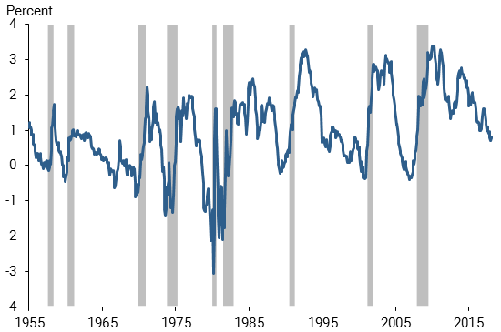
The time series figures for the most basic of business cycle macro analyses: What is to be explained and accounted for


Posted by at 7:37 AM
Labels: Macro Demystified
Sunday, March 11, 2018
Economic Forecasts with the Yield Curve
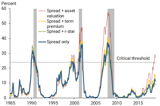
From the Federal Reserve Bank of San Francisco:
“Forecasting future economic developments is a tricky business, but the term spread has a strikingly accurate record for forecasting recessions. Periods with an inverted yield curve are reliably followed by economic slowdowns and almost always by a recession. While the current environment appears unique compared with recent economic history, statistical evidence suggests that the signal in the term spread is not diminished. These findings indicate concerns about the scenario of an inverting yield curve. Any forecasts that include such a scenario as the most likely outcome carry the risk that an economic slowdown might follow soon thereafter.”
Figure 1
The term spread and recessions
Note: Gray bars indicate NBER recession dates.
Figure 2
Estimated probabilities of recession based on term spread
Note: Gray bars indicate NBER recession dates.
From the Federal Reserve Bank of San Francisco:
“Forecasting future economic developments is a tricky business, but the term spread has a strikingly accurate record for forecasting recessions. Periods with an inverted yield curve are reliably followed by economic slowdowns and almost always by a recession. While the current environment appears unique compared with recent economic history, statistical evidence suggests that the signal in the term spread is not diminished.
Posted by at 9:46 AM
Labels: Macro Demystified
Tuesday, February 27, 2018
Warren Buffett Summarizes Investment Lessons from Winning His 10-year Bet that a Passive S&P 500 Index Fund Would Out-Perform Actively Managed Hedge Funds
From a new blog by Mark J. Perry:
“In Warren Buffett’s 2017 annual letter to shareholders, released on Saturday, he discussed the ten-year bet he made in 2007 that an unmanaged, low-cost S&P-500 index fund would out-perform an actively managed group of high-cost hedge funds over a ten-year period from 2008 to 2017, when performance is measured on a basis net of fees, costs, and all expenses. See posts here, here and here for past coverage of Buffett’s famous bet.”

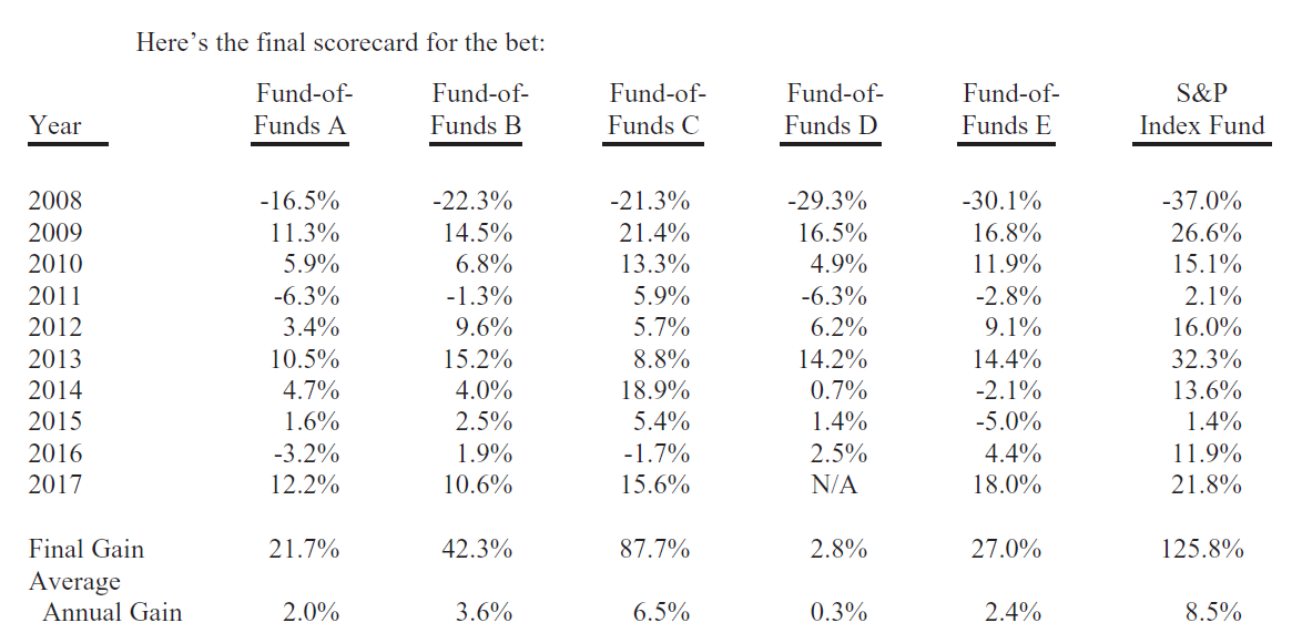
From a new blog by Mark J. Perry:
“In Warren Buffett’s 2017 annual letter to shareholders, released on Saturday, he discussed the ten-year bet he made in 2007 that an unmanaged, low-cost S&P-500 index fund would out-perform an actively managed group of high-cost hedge funds over a ten-year period from 2008 to 2017, when performance is measured on a basis net of fees, costs, and all expenses.
Posted by at 6:17 AM
Labels: Forecasting Forum, Macro Demystified
Subscribe to: Posts