Friday, June 14, 2019
Some Snapshots of the Global Energy Situation
From Conversable Economist:
“Global primary energy grew by 2.9% in 2018 – the fastest growth seen since 2010. This occurred despite a backdrop of modest GDP growth and strengthening energy prices. At the same time, carbon emissions from energy use grew by 2.0%, again the fastest expansion for many years, with emissions increasing by around 0.6 gigatonnes. That’s roughly equivalent to the carbon emissions associated with increasing the number of passenger cars on the planet by a third.” Spencer Dale offers these and other insights in his introduction to the the 2019 BP Statistical Review of World Energy. It’s one of those books of charts and tables I try to check each year just to keep my personal perceptions of economic patterns connected to actual statistics. Here are a few figures that jumped out at me.
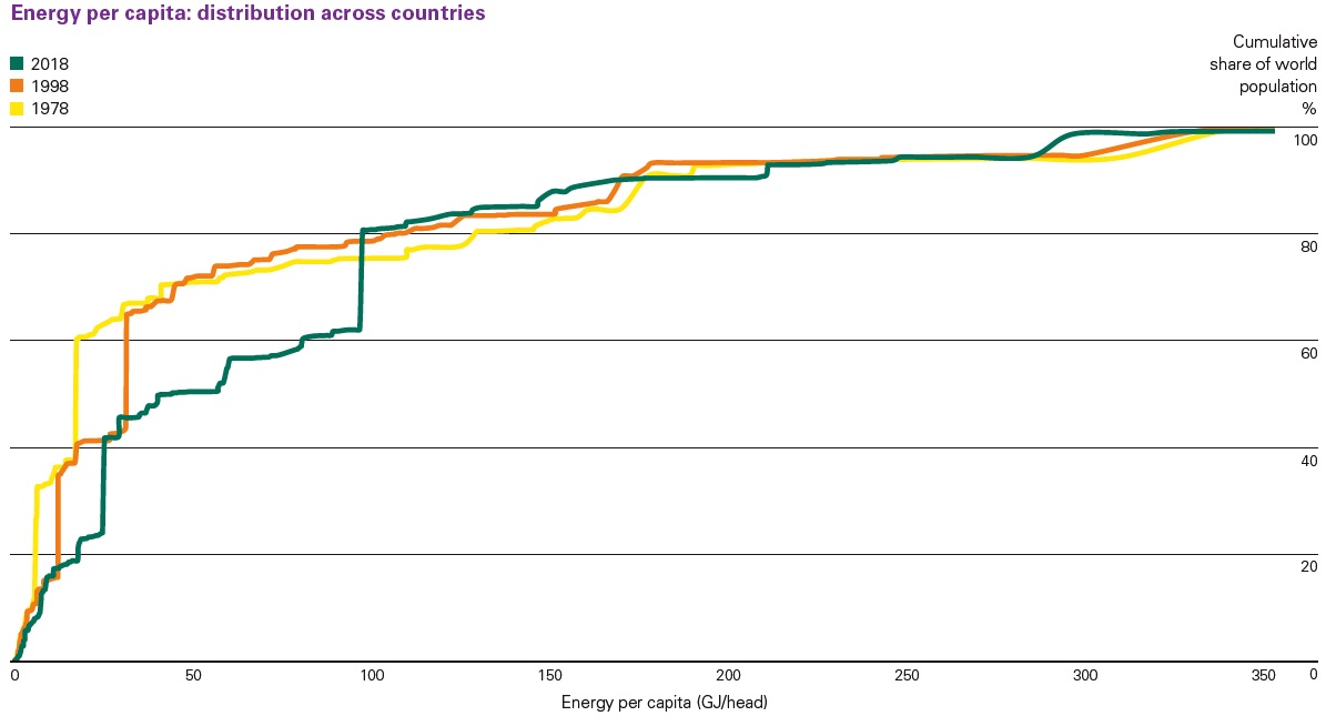
One main drive of the rise in world energy use is economic growth in emerging market countries. The horizontal axis of this figure shows average energy use per person. The vertical axis shows the cumulative share of total world population. The yellow line shows the pattern for 1978, while the green line shows four decades later in 2018.”
Continue reading here.
Posted by at 2:46 PM
Labels: Energy & Climate Change
Subscribe to: Posts